My most advanced picture in Aseprite so far, been over a decade since I did something like this.
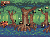
I really love the sliders you can play around with in the “replace color” tool. I begun with using stuff from the default Aseprite palette and then played around with it until I got harmonized colors that could be reused between the different elements without having it all blend together. I did decide to go with some stark black outlines on the sprites in the end because everything is so small that anything to make sprites stand out from the background is a really good thing.
If there’s one thing I’m sure I could have optimized better it would be that I have both a yellowish white and a blueish white. But since 16 colors was my goal I just rolled with it.
Edit: Oh and I made it for a contest on Reddit. I just discovered I was supposed to use their palette though, doh =P
3 Likes
 Looks nice.
Can’t say I’m thrilled with it in the specified palette (which was a 32 color palette so I did have some to chose from at least,) it’s all so saturated except for the grays.
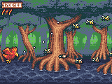
The one positive is that I feel the characters pop a lot more.
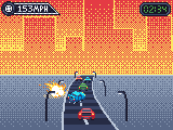
So then I made another one, trying out the dither gradients for the first time, good stuff.
2 Likes
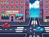
And a third one, don’t even know what kind of game this would be, doesn’t really look like a platformer… Mario is missing? =P
But hey, I’m happy with the looks of it anyways.
2 Likes