now it’s significantly colder, being only a gradient in cyan area. if that’s what you going for, fine, but people often find more pleasant when there’s a hue shift in gradient. i personally did like that it was going towards the green in the higher values.
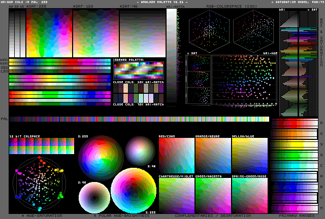
it is known as DawnBringer’s Palette Analyser, DawnBringer being its author. i’m not sure he ever wrote any documentation for it. well, give it try, maybe you’ll find something.
i believe most of the stuff is easy to understand when you look at output of really large palette (256 colours):
but feel free to ask.