# Home screen rework idea
**URL:** https://community.aseprite.org/t/home-screen-rework-idea/15577
**Category:** Features
**Created:** [September 2, 2022, 12:05am UTC](https://community.aseprite.org/t/home-screen-rework-idea/15577 "2022-09-02T00:05:20Z")
**Posts on this page:** 10
**Page:** 1
### Author:  [@creeper-keeper](https://community.aseprite.org/u/creeper-keeper)
#### Post date: [September 2, 2022, 12:05am UTC](https://community.aseprite.org/t/home-screen-rework-idea/15577/1 "2022-09-02T00:05:20Z")
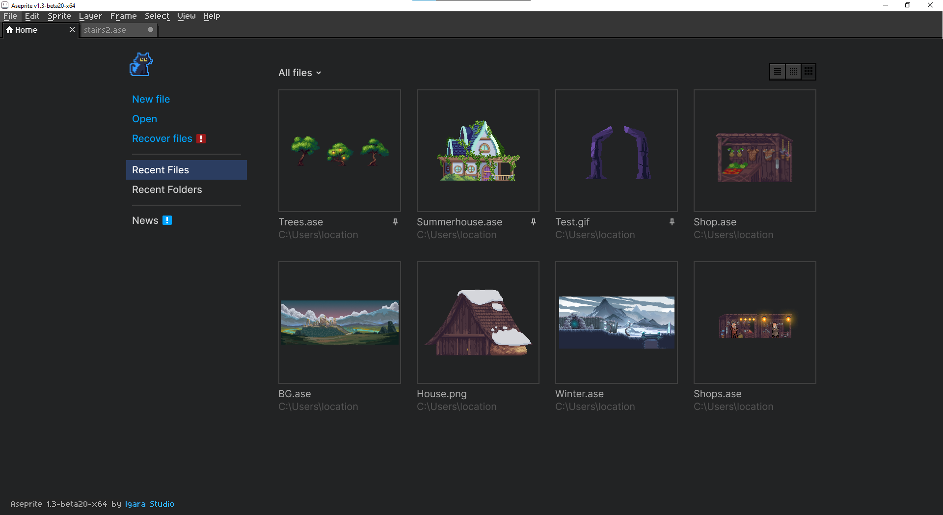
Some refreshing layout for the home screen may be more convenient and more presentable as well. Sorry for the non pixel UI. Created it in a hurry!
If you like it I can do more of it.
---
### Author:  [@eishiya](https://community.aseprite.org/u/eishiya)
#### Post date: [September 2, 2022, 12:54am UTC](https://community.aseprite.org/t/home-screen-rework-idea/15577/2 "2022-09-02T00:54:03Z")
I’d love to see something that shows thumbnails like this, but still keeps recent files on the same screen as recent folders, somehow. Recent folders can probably be condensed to a narrower column than they are currently, and the thumbnails don’t have to be quite so large, so maybe it’s possible to fit three columns (menu, files, directories) within the full space, with Recent Folders split off into a separate page when the window is small.
---
### Author:  [@creeper-keeper](https://community.aseprite.org/u/creeper-keeper)
#### Post date: [September 2, 2022, 5:47pm UTC](https://community.aseprite.org/t/home-screen-rework-idea/15577/3 "2022-09-02T17:47:00Z")
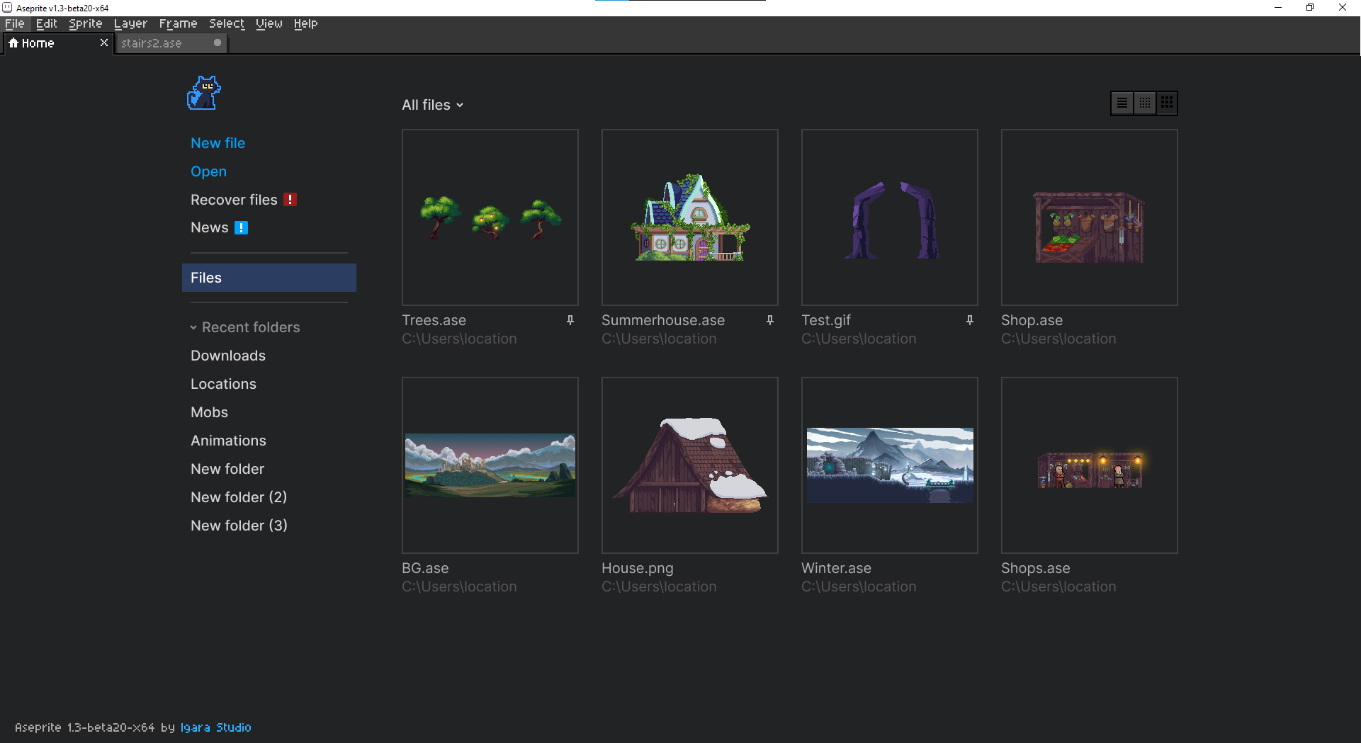
Yes, there are plenty of possibilities in the UI. I just described the core of the idea.
---
### Author:  [@eishiya](https://community.aseprite.org/u/eishiya)
#### Post date: [September 2, 2022, 6:15pm UTC](https://community.aseprite.org/t/home-screen-rework-idea/15577/4 "2022-09-02T18:15:14Z")
I think putting the recent folders under the menu gives off the wrong idea about how they work, makes it look like if you click a folder, its contents will be displayed in the main panel, when what it actually does is open an Open file prompt in that folder.
Shame, because aside from that, I think putting it there is rather clever (especially if the full path is included the same way as for the thumbnails - without the full path, the recent folders can easily become useless, as it’s fairly common for different game projects to have similarly named folders).
(FWIW, I don’t expect you to make mock-ups based on my feedback! Just voicing my concerns so that they can hopefully be useful if/when it comes time to design an actual UI based on the idea of having thumbnails in the recent files list. A drawback to including mockups is they make it very easy to accidentally stick too close to the mockup rather than focusing on the core idea behind it xP)
---
### Author:  [@creeper-keeper](https://community.aseprite.org/u/creeper-keeper)
#### Post date: [September 2, 2022, 6:35pm UTC](https://community.aseprite.org/t/home-screen-rework-idea/15577/5 "2022-09-02T18:35:53Z")
I agree. Many things here can and should be changed to the way developers see it
---
### Author:  [@dacap](https://community.aseprite.org/u/dacap)
#### Post date: [September 2, 2022, 8:27pm UTC](https://community.aseprite.org/t/home-screen-rework-idea/15577/6 "2022-09-02T20:27:18Z")
Thanks for sharing @creeper-keeper ❤ It looks great. Some years ago I though something similar after seeing Photoshop & Affinity Photo start screen.
A possible option for recent folders would be that after clicking them we start browsing those files in the home tab itself. And we can navigate each opened folder as a item in subtabs:

---
### Author:  [@creeper-keeper](https://community.aseprite.org/u/creeper-keeper)
#### Post date: [September 2, 2022, 9:27pm UTC](https://community.aseprite.org/t/home-screen-rework-idea/15577/7 "2022-09-02T21:27:19Z")
Looks cool. Like a File explorer inside Aseprite!
Just as I said there are plenty of options
---
### Author:  [@eishiya](https://community.aseprite.org/u/eishiya)
#### Post date: [September 2, 2022, 10:39pm UTC](https://community.aseprite.org/t/home-screen-rework-idea/15577/8 "2022-09-02T22:39:04Z")
While that would be cool, I like to use my OS’s native file browser’s features, so I’d like for that to still be an option.
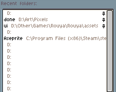
On a vaguely related note: the Recent Folders list would be a lot cleaner if it didn’t include duplicates xP This is just silly:
---
### Author:  [@CindyTheCat](https://community.aseprite.org/u/CindyTheCat)
#### Post date: [September 3, 2022, 8:08am UTC](https://community.aseprite.org/t/home-screen-rework-idea/15577/9 "2022-09-03T08:08:03Z")
I would really love it if there were thumbnails, if I have to choose a file, I have to read through all of them to get to the one I wanted to select.
---
### Author:  [@dacap](https://community.aseprite.org/u/dacap)
#### Post date: [September 23, 2026, 5:55pm UTC](https://community.aseprite.org/t/home-screen-rework-idea/15577/10 "2026-09-23T17:55:14Z")
Too many years have passed:
>
>
> Implements the new home screen (#3531)
>
> Here's a short walkthrough video of th…e look and feel:
>
> https://github.com/user-attachments/assets/b0fb894f-a80e-4164-8c37-708758728b9e
>
> and some theme compatibility (mostly randomly sampled from itch)
>
> https://github.com/user-attachments/assets/66221d8e-ac80-4823-83c5-8d9488b8c30a
>
> Some of the changes made for this PR:
>
> \* Theme switching was changed so that we ask for the scale adjustment before we apply the theme, so now you won't have hard to read wrongly-sized popups. We also do some post-switching re-adjustment to prevent the preferences window from breaking too much, it's not perfect but it's much better now.
> \* Layout loading was switched to Window opening messages so splitters saving their position should now actually work
> \* Extracted the inline widget searching logic from Tree to be reused here, for convenience, into a more generic \`InlineSearch\` class.
> \* Moved the Data Recovery View so that it no longer depends on Home
> \* Added the concept of "default" to SkinParts, to be able to implement compatibility with themes, hopefully a theming refactor can remove this soon™