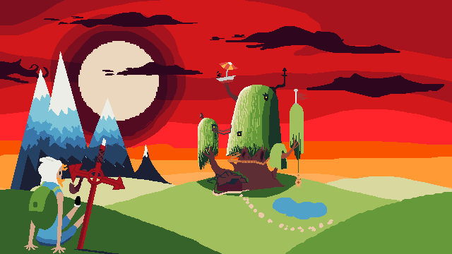
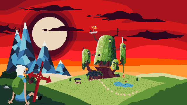
I’m stil working on it. I hope you like and give some advice
5 Likes
It looks pretty recognizeable even at this stage and I like the ideas going into it although I think there are definitely some oddities. To fix these It would be good to get some references of your own if you haven’t already.
The legs look a bit strange and disconnected in the directions they face and the ends of the shorts are not consistant with the other side. I have noticed by looking up pictures of Finn sitting that he either has his legs very straight out in the same direction or bent in a curve shape. You can find Lots of Finn sitting pictures
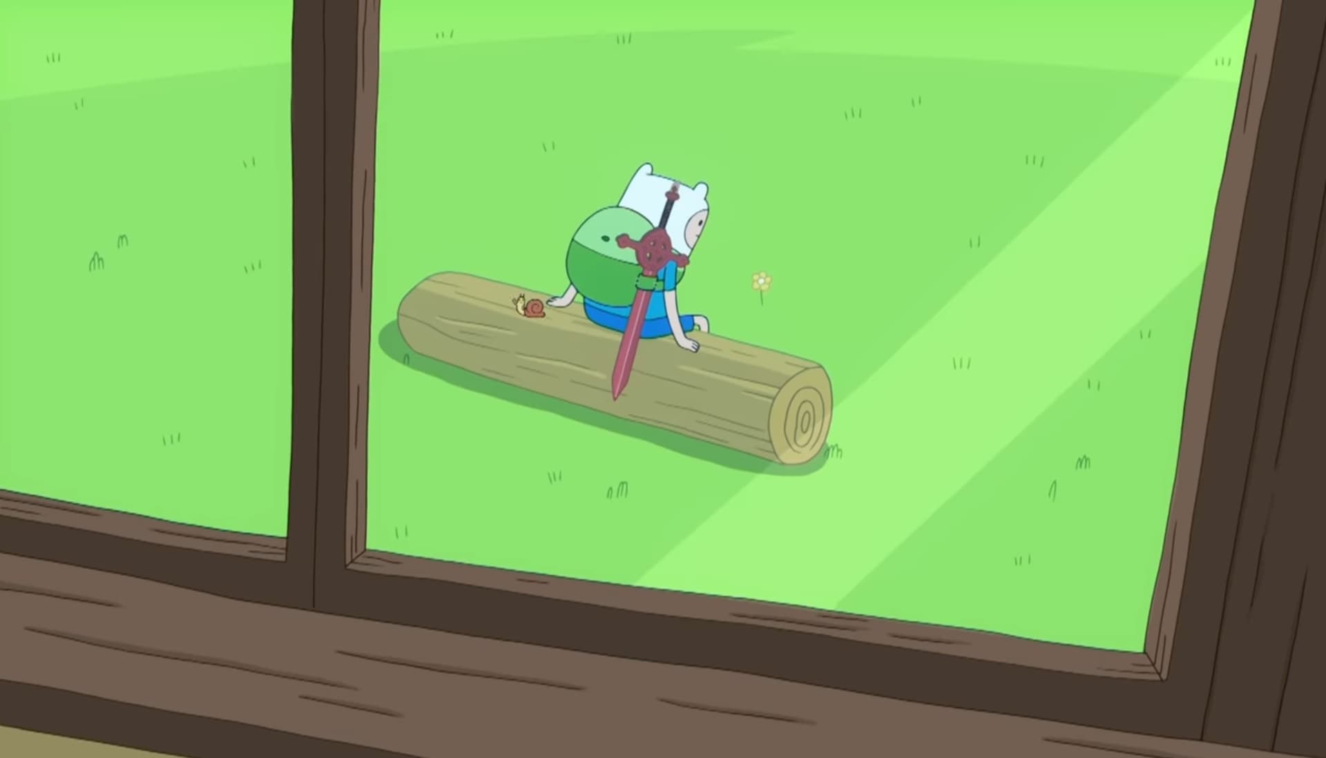
The head and body looks very humanlike rather than blocky bean shaped cartoon, this isn’t necessarily bad but something to be intentional about. As far as the arms go I found this picture for reference which also has the Demon Blood Sword to use for size comparison.
Wierdly enough the sun uses larger pixels sometimes and at other points smaller pixels, try to keep this consistent unless you want it to seem blocky compared to other objects.
Using the red sky to your advantage would be good, I made a SUUUUUPER quick mockup of potential lighting using a mid to dark red filled layer set to multiply, if you turn down the opacity some then it looks like a darkened version of the scene, which you can then start erasing to give the scene some light.
Keep in mind the direction of your light source when lighting your scene. If Finn’s backpack is dark green and the ground is dark green then it will blend into each other.
3 Likes
hi and thanks for advices. I am not good at lighting and your advice will help me.I created this for just fun and didn’t think about legs, sun’s pixel etc. Also ı am not sure about red sky But you definitely gave me motivation to continue this project. Thanks for reply. I will share final project when it is done. Have a good day:)
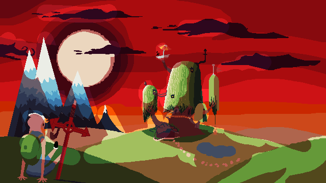
I work on this for about 4 hours. Thats what ı done so far
2 Likes
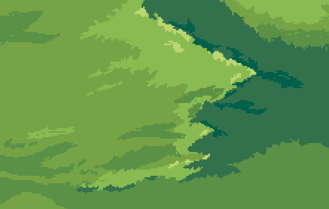
Quite the improvement! The grass detail (regardless of distance) should probably be a bit more consistent, I don’t think you need to show so many strands…
This is a grass tile, which is what this patch looks like.
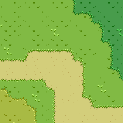

And this is a more generalized grass (what you have started making in the foreground)
Choose one you like or that looks better, maybe a mix of both.
If you experiment with the grass and shadows more you will get more experience which would be useful!
1 Like