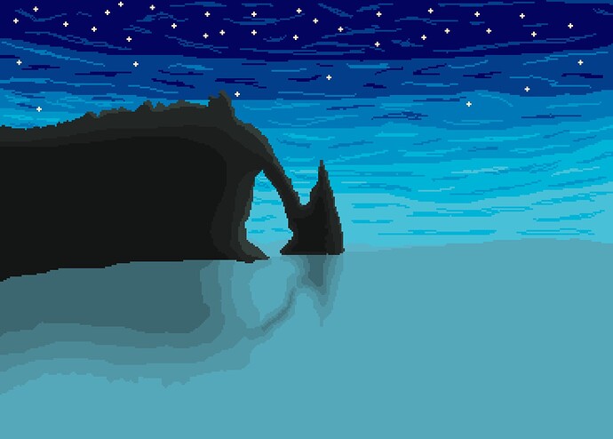
Greetings, I recommend using a deep blue color for the sea. For waves, consider foamy white highlights, and darker blues work well for depicting deeper water where waves form. Don’t forget to capture reflection, stars glinting on the water’s surface adds a magical touch.
- Look at a reference for similar lighting.
- Depending on the color saturation or brightness level of each element (rocks, sky, trees, stars), ensure each element is represented well with vibrant colors in the areas you want to attract attention to.
- View the art from a distance, use mirroring, or utilize the preview window to gain a new perspective.
- Consider the colors of the shadows because sometimes the sky reflects into shadows, making them appear blue(Oversimplification), while other times it isn’t noticeable.
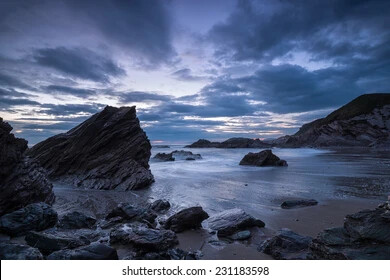
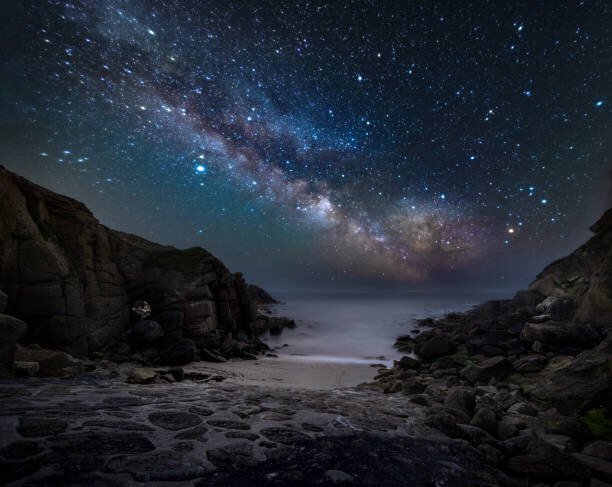
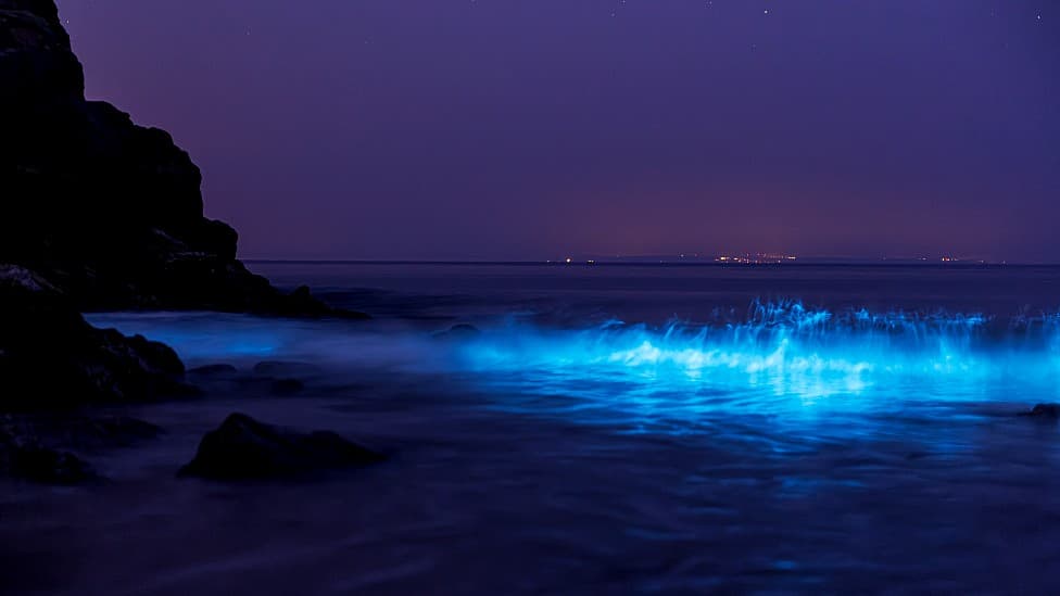
Here are a few examples of my thoughts looking at potential references, these I grabbed off Google.

Tip 1: Be mindful that the light is coming from the top left, where the sun is rising, and your shadows are also going to be in that direction.
Tip 2: Keep in mind that reflections can become slightly distorted due to the back and forth movement of the waves.
Tip 3: You can use solid colors with subtle highlights to create a sense of depth and form. For example, look at these rocks: they are mainly black with just a hint of light.
Tip 4: I really like the way this blue color appears brighter between the wave and the lower level. You could try something similar or develop a similar color scheme.

Tip 5: The rocks and galaxy sky in this picture draw the most attention, and the hazy ocean in the background could add a touch of realism to your image.
I like your image, good luck with your improvement!

