Could I have critique on this piece?

2 Likes
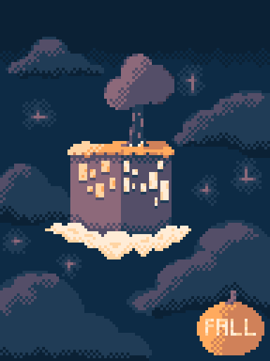
This is a pretty mellow piece. I love the duo-tone you’ve got going on here, the oranges stand out more. The cloud base there seems a bit over-exposed compared to everything else, is it meant to be emitting its own glow?
The only thing I think could use a touch-up is the pumpkin on the bottom-right there; its roundness and lack of texture make it look more like a tangerine.
Have you considered making a short, animated loop of this? It would make for a nice banner.
1 Like
Animated loop?
Of what, just the island going up and down?
Sure, maybe even the background sky scrolling by, but it’s your decision entirely. Your piece just invokes in me a sense that it would be animated; not entirely sure why, but it does.
2 Likes
Same. It would be very serene if animated. As if you’re floating just outside that tower(?) and watching it as it drifts through the sky
1 Like
this looks perfect; in my eyes, nothing could make it any better.
you could potentialy centralize the island a bit and a loop of it boobing up and down would be greate, alklso try to put a figure resting on the tree it owuld add quite a bit of extra deep, but ovear a solid piece most of what i put here are rellys just some suggestions not much of a critique