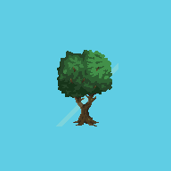
A tree I drew. Just wondered if anyone had tips for getting started and opinions on my artwork. Thanks! 
A tree I drew. Just wondered if anyone had tips for getting started and opinions on my artwork. Thanks!
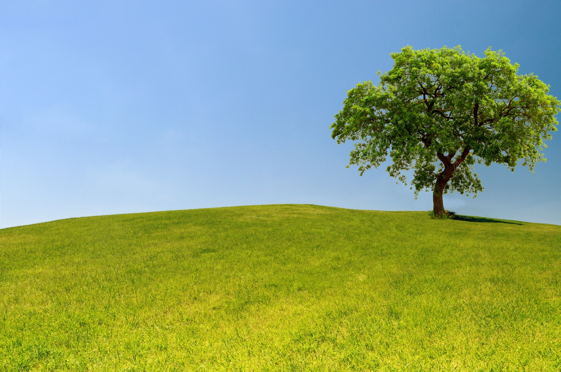
This one looks nice  I think the shading is really good, the only thing I think is weird is the placement of the branches on the tree, like imagine a tree like this ![image|690x431, 50%] you barely see anything, and when you do its between the different layers of leaves not really sticking out that much its more of a structure for the leaf clumps.
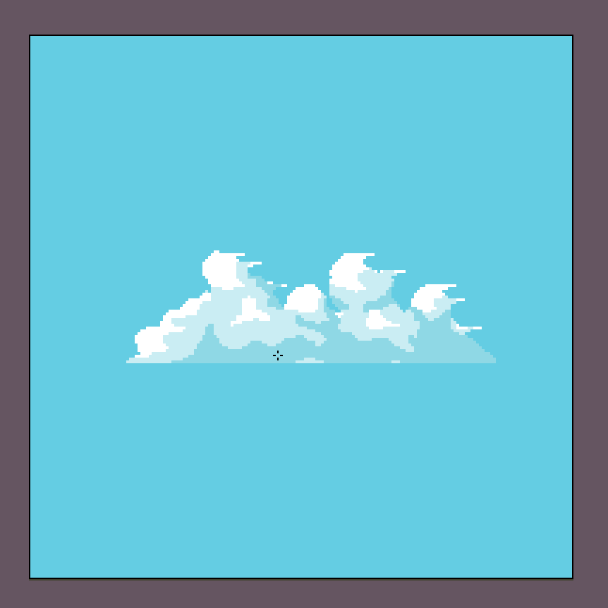
Your cloud looks almost perfect, I can almost see its slowly moving across my screen. the bottom is a bit flat but if that’s intentional its fine.
Very nice, but I recommend you check for hue shift, its a very useful technique for shading ^^
That’s a good point!
If that’s the work of a beginner, then I’m a baby.
What’s the best way to take the color pallet from this photo to use in aseprite? New user here. Thanks!
Hi @Chamcham I would suggest making a pallete with enough contrast that you can see the difference between the colors in the preview window of aseprite; while looking as close as it can to what you want.