I know there have already been some posts about dark theme, but I would like to make my own to draw attention of the developers.
First, thank you so much for adding native dark theme! It’s so great to have this as a built-in feature in Aseprite.
Now, here’s the issue: unreadable text.
The news and file locations are barely readable on main screen because the text blends with background:
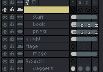
And it’s also hard to read folder names in layers menu when they are marked by some color, especially when selected. It lacks contrast:

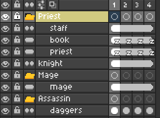
And here’s how the same features are implemented in Dase theme by Krad:

As you may notice, everything is much more readable.
So the solution is:
- Make the text brighter than the background;
- Make the text change color & contrast in layer folders depending on the color used.
I hope this post to be noticed and thank you for creating this wonderful piece of software.
Much love!

