Let’s say I need green for grass. I’ll have to Google an image of grass, scroll through and find one that I think is right, save it, export it to this color identifier page I use, hover over the part of the grass I want to identify, copy the rgb numbers and paste them into aseprite. A bit tedious. I have to do this for every single thing I want to color. It would be nice to have like a basic colors palette, with like red blue green yellow etc with a small text bubble that pops up with the names of those colors. Nothing fancy like magenta or turquoise needed. Not asking for like 500 colors and text bubbles just like maybe 10-20 colors.
2 Likes
i agree that it would be nice if user could import gpl palette and the names of colours would be shown at the status bar instead of just index and number. if the names could be edited it would be even better.
anyway, i’d recommend you to learn how tell colours apart based on their hue values:
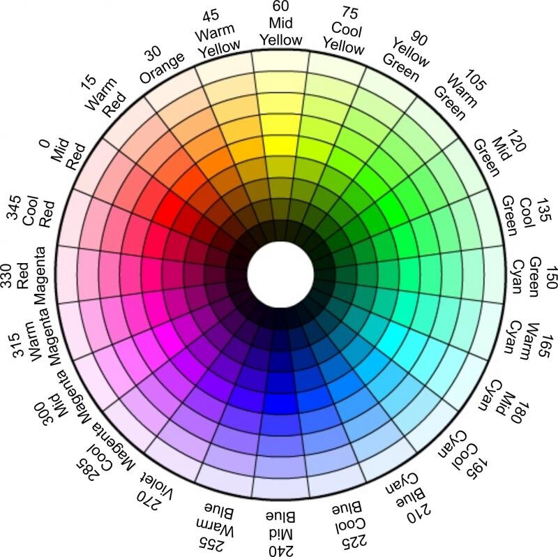
it seems like a lot of numbers, but it’s not that hard. you have to only remember order of six primary colours (red, yellow, green, cyan, blue and magenta) and the fact they are separated by 60 degrees. the rest can be deduced from that.
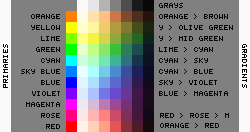
recently i made a small palette with some primaries and muted gradients with hue shifts, i’ve added comments which is which:
also, in aseprite you can open and drag image to a split window, so you don’t have to jump between apps any time you want to check or pick a colour. just drag a tab with a name of the sprite to one of the sides.
3 Likes
I agree with @Olga_Galvanova. I think switching Aseprite from RGB to HSL would help you a ton. Eventually, you could memorize where each color stands on the 360° hue wheel and reduce the need for constant reference pictures.
You see, even for those who see color normally, RGB isn’t a very good model to represent color. It’s more like a “computer-y” interpretation of it.
The HSL model on the other hand is much more “human”. It interprets color using the same values as humans (hue, saturation and lightness). That makes it much more intuitive and it might help you a lot.
1 Like