While I am creating my artwork on Aseprite, the colours look much more vibrant/saturated as compared to the output (.PNG) after exporting it. The output colours look much duller and have slightly different hue as compared to what I see in Aseprite itself. The weird thing is when I send the exact images to myself through messaging platforms such as Messenger the colours look a bit more vibrant as compared to the exported .PNG. A screenshot of the image also looks more vibrant compared to the export.
I realise this might have something to do with colour handling/colour profiles but I honestly don’t understand how colour handling or colour profiles work. Any help will be appreciated.
Please refer to the images below:
Exported image
The colours look dull and desaturated.
Screenshotted images
Screenshot of image from Aseprite. Looks a bit more saturated
I’ve also tried looking at the exported images in other devices and they still look dull
Interesting, it’s only the orange background color that gets changed. I was able to reproduce the same effect by taking your screenshot, disabling Color Management (Edit > Preferences > Color), and exporting.
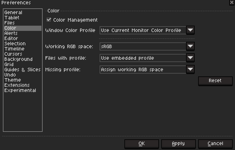
I can confirm it seems to be an issue with the color profiles, can you post a screenshot of your Color Preferences (Edit > Preferences > Color)?
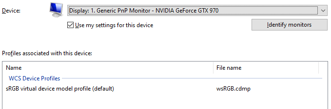
I think I got it. Definitely a color profile problem. I downloaded a color profile online and after using my monitor’s default one the exported color became similar to Aseprite colors. I think a corrupted profile got embedded into the export or something like that.
How I fixed it: basically I went into Window’s color management settings and switched back my monitor’s color profile into the default one. After that, I deleted my old export and re-exported it in Aseprite and the colors are now similar to Aseprite’s.
Also, here’s a screenshot of my current color preferences: