As I am not sure how weapons in the shape of pickaxes are shaded, I have made multiple versions
Any ideas which works best?
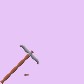
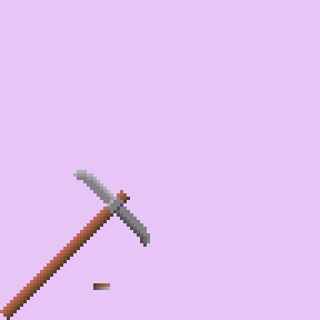
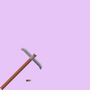
Admittedly, I feel it’s too short compared to the original in the attack-ends

As I am not sure how weapons in the shape of pickaxes are shaded, I have made multiple versions
Any ideas which works best?


Admittedly, I feel it’s too short compared to the original in the attack-ends

I think using less colours would help with making the shading more clear. And the iron piece seems a little bigger in the reference. Good luck!
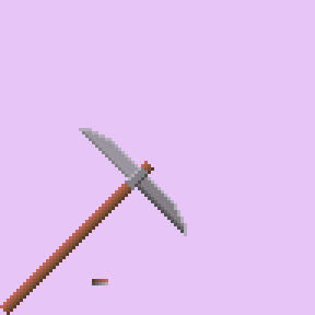
I am still honestly not sure, how big to make the iron bits…kinda hard to judge size and length and translate it, for me
Here is an example of what It could look like if you curved the pickaxe and added more contrast to your palette. I changed the palette because it had some similar colors(colors with same hue and barely any light difference).
One of the problems you had is shading, lets start with that. You used gradients in your pickaxe but I would say you might want to avoid using your palette as a gradient. You need to know where the light is coming from so you can place the shadows farther away from that source. Another thing to keep in mind is how dark you want the shapes to be, I have the handle darker at the base and lighter at the top. I also added darker outlines of the same color to the shadow side of the shape.
Next I went to work on the two parts(handle and axe) separately so I could get a shape I liked, the handle was simple I just rounded out the end by making it 2 pixels on both sides. I knew for the axe I would need to know how it looks straight up to rotate it later. I drew a straight up pickaxe and rotated it and fixed some of the lighting errors. After I fixed some curves and tried to finalize some of the lighting I got some pretty nice results I think.
One last tip is to look at the preview tab to make sure it looks the way you want when it is small or farther away.
Here some of the pixel art video channels I watch:
a video on curves:
Hope this Helps!
Thanks, I was wondering how I would properly curve the axe, I think I was trying to follow the original pic’s shape…mostly because it doesn’t look that curved itself somehow
I was also wondering how I would make the part between both “blades” when it’s part of the same steel. Been trying to find pics of pickaxes and all I got was the one from Minecraft. So the “middle” part of that metal 's dark bits are also affected by the lighting?
As for wood, I admit, I am trying to follow only the very basic, but man yours is better than simply the “gradient”
I’m kinda busy with other stuff still and barely practice…and have a hard time even knowing how specifically to practice even with vids, but this really helps
Just think of the 3D shapes and where the creases are, if there is light being blocked use a darker color. If you want to improve a lot I would suggest finding tutorials and artists you learn from on YouTube or some other platform.
Thanks, been trying to look for specific guys so far, I’ll look again
it seems better than your previous works