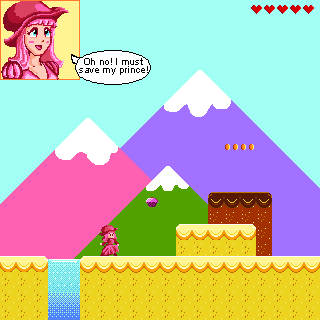
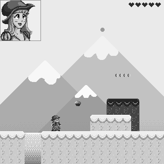
I made some mock ups for a couple of game concepts, but I’m still not super familiar with how to use this medium. I like these so far but they definitely need some changes. I’m just having a hard time pinpointing what… something just feels off. I can’t tell if its composition or my color theory being a little off or what. ![]()
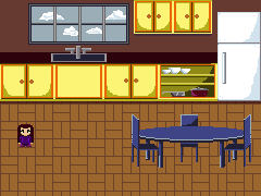
I do know that the kitchen scene is a little flat due to the lack of a designated light direction, also I haven’t created a run cycle for the girl so other than those obvious eyesores, any and all feedback is greatly appreciated! ![]()