First Palette - Feedback

How can i improve this palette?

first

To see if you can improve it just use it. Draw water with underwater black silhuettes, draw sky with white and dark clouds, draw anything :slight_smile:

2 Likes

Thank You!

i agree with BraidAcer, using the palette is necessary. make different tests and smaller pieces and tweak the palette along the way.

apart from that, here are some scripts which can help you with building palettes:
behreandtjeremy’s convert to greyscale - Understanding Colour Value with HSL/HSV - #3 by Olga_Galvanova
dawnbringer’s palette analyzer with pure asbestos’ shim - A feature request because I suck at colors: Color lines! - #9 by Olga_Galvanova
and quick mixer - Quickly mix two colours

convert to greyscale is good for checking values:
temp-values
for example, here we can see rather big steps between darkest values, but much smaller steps in the higher-mid tones. maybe you can get rid of one of those two colours (nr. 5 and 6). maybe you can put extra steps elsewhere. it’s up to you, but usually you want to have as smooth gradients as possible.

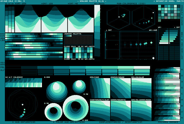
palette analyzer is more useful for larger palettes, but even for a small palette like this it can show relations between the colours. it shows as well that hue gradient looks good, but the value steps are bit inconsistent:
temp-dbpa

quick mixer just mixes foreground and background colour in 1:1 ratio. i use it for anti-aliasing and making new steps between values.

2 Likes

Thanks for this accurate response! I’ll try removing number 5 and 6 like you said!

image

About this photo, i know i can find this on lospec, but i don’t know how to “read” it properly.
Can you tell me what’s its name so i’ll find some tutorials?

I’ve also tried to adjust the palette, what do you think:

lHD57VA_46x

image

now it’s significantly colder, being only a gradient in cyan area. if that’s what you going for, fine, but people often find more pleasant when there’s a hue shift in gradient. i personally did like that it was going towards the green in the higher values.

it is known as DawnBringer’s Palette Analyser, DawnBringer being its author. i’m not sure he ever wrote any documentation for it. well, give it try, maybe you’ll find something.

i believe most of the stuff is easy to understand when you look at output of really large palette (256 colours):
image
but feel free to ask.

I’ll probably do a lot of questions since i want to understand the color theory really good, so if i’ll be a bother just say so and i’ll try to figure these things out myself :joy:.

fhg 2

image

I’ve tried to do the “hue shifting” you talked about, what do you think?

And i’ve tried to adjust the saturation to make it more colorful while it being interesting to the eye, what’s your opinion on this one?

If it can helps your evaluation i wanted to create a palette close to the one used on this drawing

oh, i see, fake game boy palette. well, you’re certainly getting closer now. if that’s your reference, try to apply the palette on that image and see for yourself:
Sprite-0001 Copy
i guess you don’t even need to check it in palette analyzer to see that original palette has much bigger hue shift and much darker ‘black’.
so, now, when you have this image in indexed mode, you can make a copy, switch on ‘edit color’ option and start tweaking:
Sprite-0001 Copy Copy Sprite-0001 Copy Copy
add more colours from your palette and see how it works for you. and of course try other images as well.
don’t be afraid to experiment and even over do it - you can always change stuff if you don’t like it.

1 Like

Thank You So Much!

1 Like