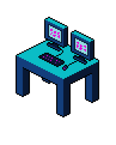
I decided to try out an isometric art style with cyberpunk colour scheme.
What do you think?
How can I improve it?

There’s a really helpful script called Isometric Box Generator that can help with this stuff. I’ve used it in the past to quickly rough out something before going in and adding details.
I know some people are against using scripts to get started but I feel like it’s the difference between using a belt sander vs hand sanding something. Yeah you can do it the hard way but if you need to do things a lot then you should choose the fast way as long as it’s the same quality.
Thanks for that, I didn’t even know asperite supported scripts, will have to make some myself ![]() thanks for sharing. I did build mine using standard blocks that I had created and hand drew some additional parts.
thanks for sharing. I did build mine using standard blocks that I had created and hand drew some additional parts.
The concept is reasonably straightforward so far, but it might be a good idea to add more detail to the mouse and keyboard that seem a bit flat. You can imagine the keyboard as a cube and the mouse as a half-sphere that is stretched out. Give both objects some depth (at least the same amount as the monitor stand).
When shading, consider the sources of illumination and what areas are lit. If you watch tutorials on painting an object, many concepts carry over. Base color, shadow, bounce light, highlights, ambient occlusion, etc…
To elevate this pixel art, you can use the screen as a light source pushing the area behind and between the monitors to be darker, creating two cone-shaped beams of light that light up the mouse and keyboard (with the brightest light in the middle).
Try adding a light source, and reimagine the shading of the isometric objects in relation of the direction of the hypothetical light. In this sense might be useful to use pencil tool in shading mode.
And another thing: try to add some chaos and some aging for the various objects.
That looks so cool! Idk if it needs improvement bc i’m not a pro:(