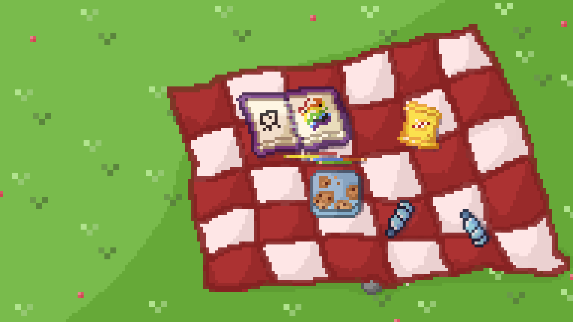
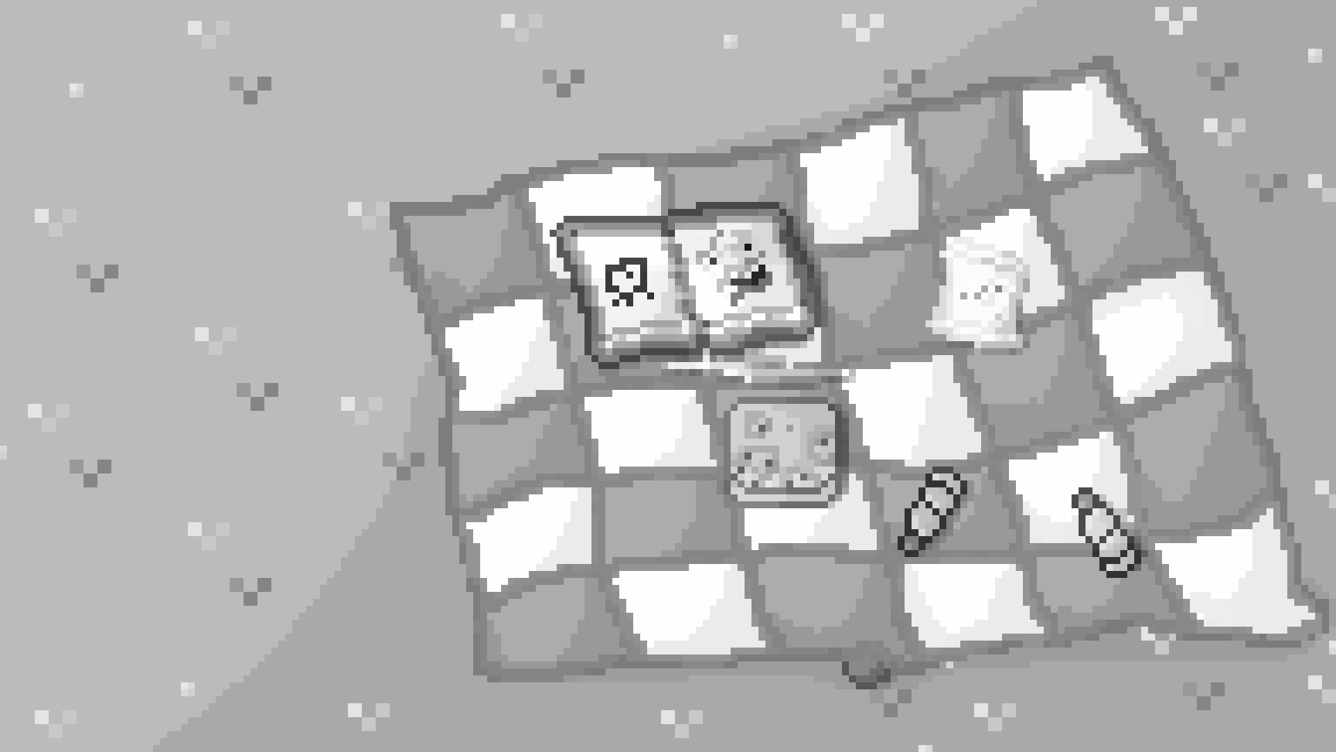
It looks like a fun scene! Here are my tips. I noticed that the line thickness of the pixels is inconsistent. For example, the grass has three large pixels while the shading for the grass is much smaller. Objects like books, bottles, and chip bag should have more depth. Additionally, the colors could be improved. Using the shortcut Ctrl + A to select everything on the layer and Ctrl + U decreases the saturation and shows a preview of the desaturated image.
This will help you see what the focus of the image is. In this case, the bottles and the book have the most black-to-white contrast. However, the book’s edges blend too much with the scene because they have a gradient. Overall, I think you’ve created something great! If you’re interested, the next step could be to learn the basics of creating pixel art. Here is one of the articles I found:

