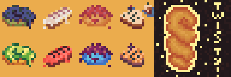
I’m surprised I managed to finish it after procrastinating these past few weeks, and I’m afraid I forgot some of the things he taught in the video already. But here it is, and here I am! I would really appreciate some critique and advice on making shapes more easy to understand at a consistent perspective. I find it amazing how other people can show perspectives with the limited pixels they can work with!
5 Likes
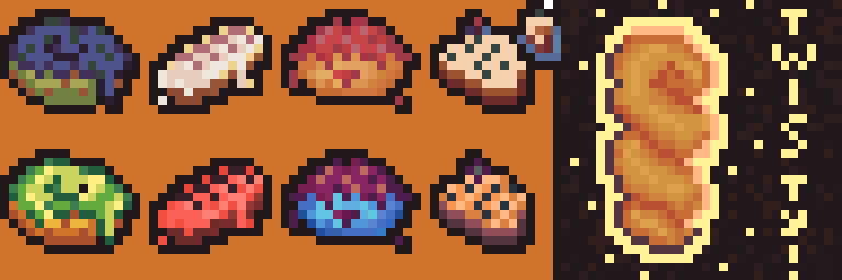
I love the colors and variety! If I were to do it I would make sure to emphasize the contrast and/or use dark and light borders. Here is an example of what a proposed edit for borders may look like. Remember to look at the preview to see what you donuts look like when they are small, this can help you know if they look good or are what you want.
2 Likes
Thank you! The borders really make them pop more. I feel like the darker background color helps a ton too! I’ll be sure to keep these in mind.