Hi everyone,
While I was testing out some grayscale / monochromatic stuff, I had issues with the default Aseprite GameBoy palette. So I made a survey of GameBoy palettes I could find around the internet.
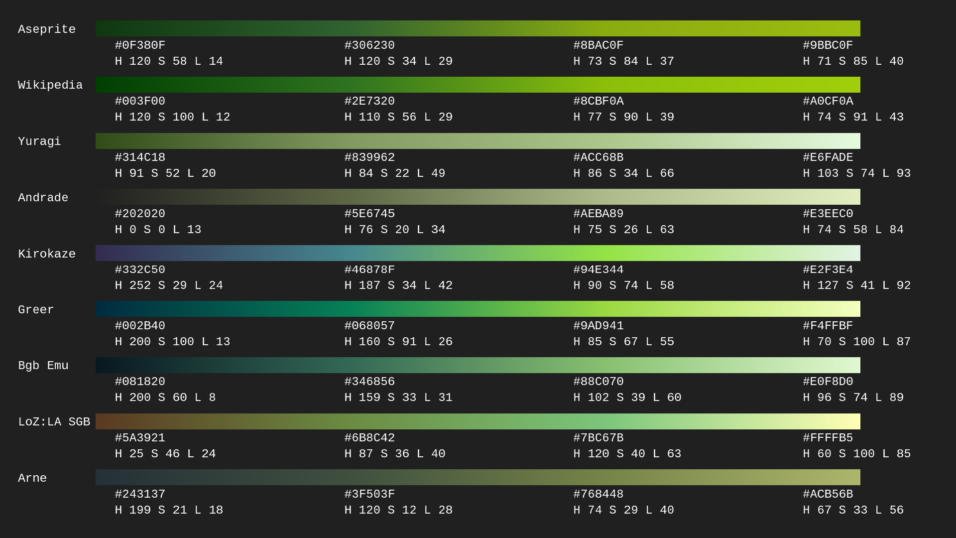
Here are my sources:
- Wikipedia
- Yuragi Channel
- Andrade
- Kirokaze
- Greer
- BGB Emulator
- Link’s Awakening (SGB)
- Arne
All palettes contain 4 colors originally. The ramps above were generated by linear interpolation in RGB.
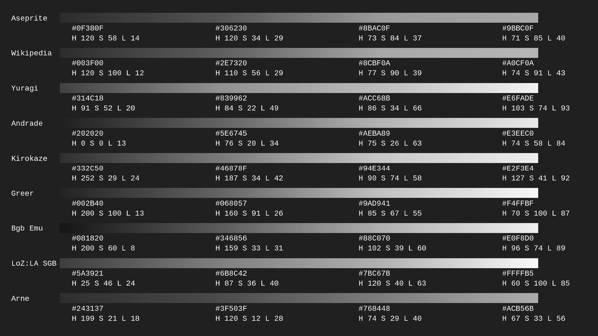
Here’s the same image, but in grayscale (created with Aseprite’s to grayscale conversion).
There is typically more variation in luminance between the third and fourth colors, counting from left to right.
For science, I took a “wisdom of the crowd” approach and averaged the palettes together in HSL, except for Aseprite’s. Then I converted to RGB. Here’s what the computer spat back out:
H 135.83983
S 51.03161
L 16.397058
#143f20
H 122.7701
S 38.075405
L 34.852947
#377b3a
H 88.59005
S 49.863308
L 55.56373
#90c655
H 84.023544
S 71.35483
L 78.77451
#d1efa2
I’m kidding, I realize that’s neither a great way to analyze nor create a palette. But if anyone has any recommendations for other classic GB palettes, feel free.
Jeremy
well, it depends on what’s your goal. none of them is technically correct :]]
for development, requirements of specific tool are more important and for looks it’s kinda free for all.
for example gbstudio requires #e0f8cf #86c06c #306850 #071821 and #65ff00 for transparency. and because you can change those colours, four games showcased on front page use three different palettes :]]
i’d say wikipedia and aseprite are probably close to brand new real life display, but i prefer arne’s palette - it has warm, dull, worn out look i like.
i know that some people went so far they actually measured signal output on their devices, but those were sega consoles. i don’t know if anyone did something like that with gameboy. there’s so many variables: adjustable brightness, age, different displays, gb pocket (greyscale), gb light (grayscale with backlight) etc.
1 Like
The GameBoy was… pretty bad at colour, and I think the Aseprite and Yuragi palettes communicate that and how uneven the value scale was pretty well.
It’s generally not a general-purpose palette and is best-suited for previewing work meant for real hardware to get a sense of readability. For making GB-esque work, I do think a different palette is best. I rather like the BGB palette for that, and the one that GB Studio uses is pretty nice.
Edit: @Olga_Galvanova You left out the part where the original GameBoy, lacking a backlight, so strongly depended on the external light source for how its colours looked ;D
1 Like
:]] yeah, i doubt it is possible to simulate how gb palette looked on real device.