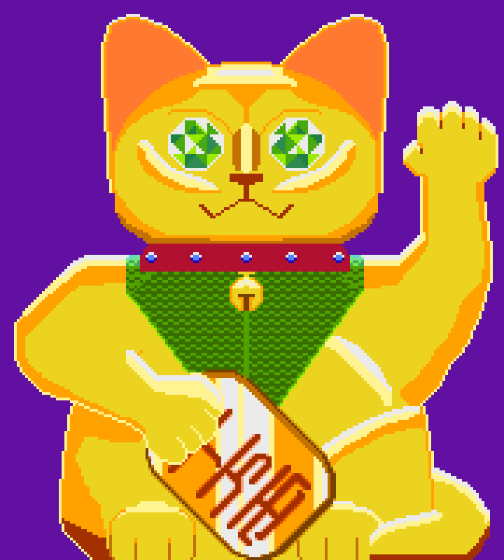
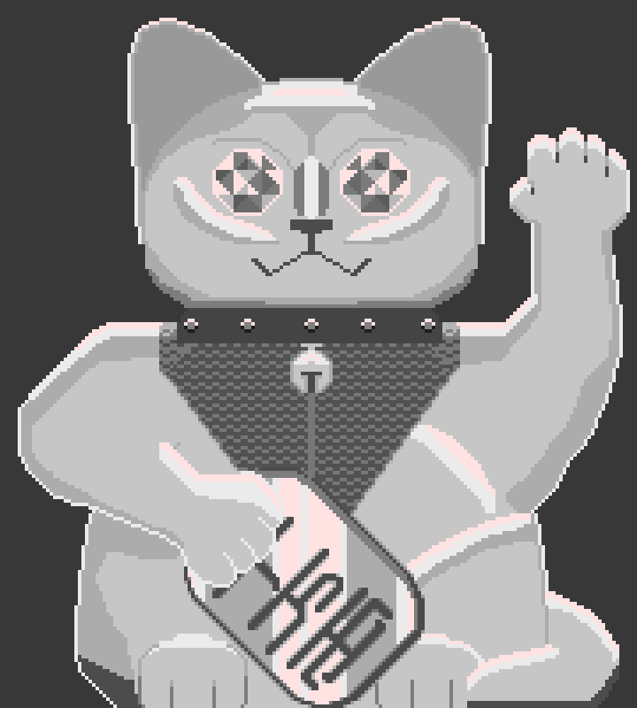
This is fun! I like the colors you picked.
As far as critiques I noticed that there are no contact shadows in certain areas, particularly underneath the collar and neckpiece. Additionally, the very dark color at the bottom, which is also used for the mouth, doesn’t appear again, resulting in a lack of contrast. The white outlines don’t give a shiny effect; instead, they make it look more transparent, almost like jello!
It’s essential to choose a direction for the light source to illuminate the metal. You can also integrate reflections from the environment, allowing colors to bounce around. For instance, introducing some purple into the shadows could enhance realism through a lighting layer.
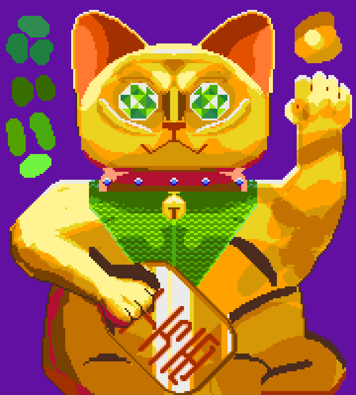
Regarding your palette, using it with an ink mode on your brush can make shading easier. Use the ink shading option(in the ink bottle settings). Select your colors by clicking and dragging; when you draw with them, the shades in the image that match those in the selected colors will either darken or lighten to match the next shade up or down depending on how you adjust the settings in the dropdown next to the ink bottle icon. Make sure to return the ink mode to simple ink when you want more basic control.
It can be messy but it gets ideas down faster so maybe keep an extra layer from before this step.
I notice you have some redundant colors in your image (the ones that look similar when you squint)
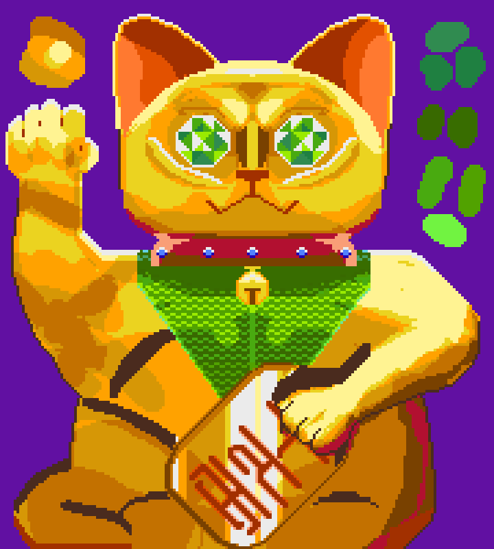
If you flip your image (either shift + H or Edit > flip horizontal) then you get a better idea of what might be wrong
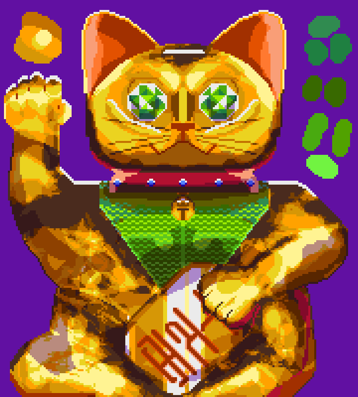
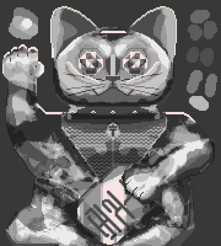
After some more tweaking like adding whiskers, highlights for the eyebrows, adding more brown colors, shadows in the ears, using some of those blueish greens in the neck piece, darkening the eyes a bit for the inset gem look, and a lot more shading (including using a layer mode to darken eyes[if you want a super strict palate then avoid]) I got here:
In the end, if you compare a desaturated version of both images you can get a better idea of what would be good to change in terms of values(brightness).
It’s quick and messy so if you don’t like any aspect of the changes I hope they are at least a useful comparison to you.
![]()
