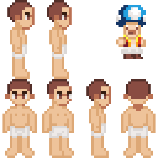
This is on 32x32 version, which is more standard
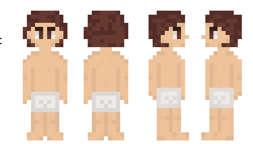
I think the outlines of the shorts would be a bit darker, or at least have darker skin towards the inner side.
Some colours are too light and could be more saturated to give more life. While the lights of the hair could use some toning up.
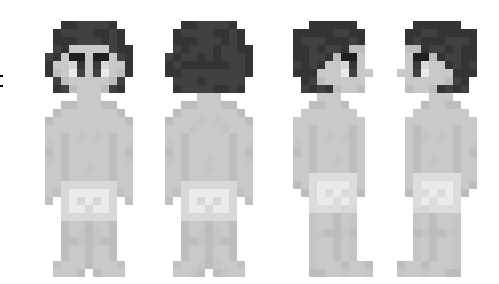
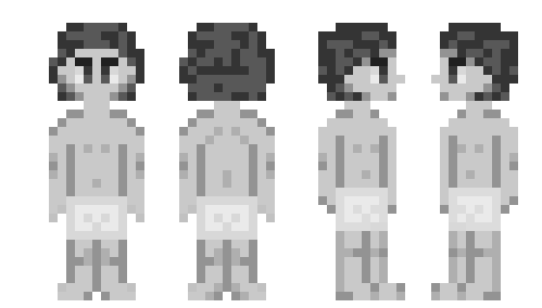
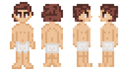
I also made some adjustments to the hair
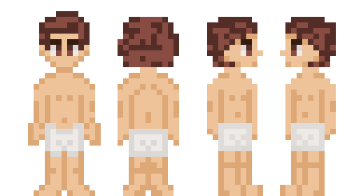
With this change, you can see a more defined palate start to form meaning that it doesn’t make as much sense to have such dark outlines on the inside of the forms(body outline).
If you don’t want to see the ears you can hide them in the hair and create a hairline next to the eyes.
One of the biggest problems I can see is that you haven’t got everything in even spacing which would be easier to work with. The 1-pixel space between the eye is prevalent but not very useful in this case as it gives a bit of a cross-eyed look.
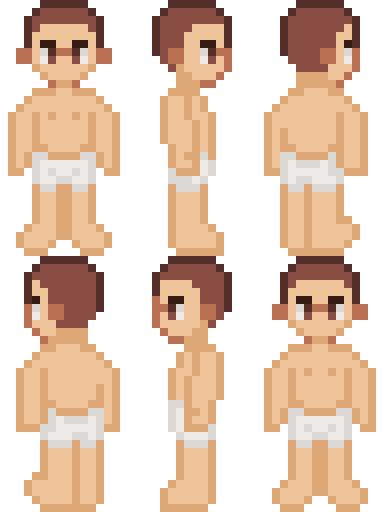
I noticed the side view sprite looked like a 3-Quarters view because you can see the other leg. It would work to do it that way for sure but it needs to be purposeful.
Was your inspiration Stardew Valley?
Is this a character or a base for characters?
If it is a base it needs less unique hair.
I made sure to shrink down the sprites to 16x32 grid lengths and then the more I worked on it for a while I realized I should just try making my own version of the concept(complete with toad) based on my own experience and even made a little spin around. (note: the spin around is the most updated version of the sprites)
