When you’re starting out with pixel art, making your own palettes can be kinda hard and even overwhelming. This is why I’d recommend using other people’s palettes at first - there are tons of them at Lospec (Palette List), and seeing what makes them good, thus learning from them.
If you still want to give this a shot, I’ll try to explain my process of making a palette. I don’t know Mislav or his tutorials, so this might differ from his methods.
- Choose how many shades per color you want. That is lighter and darker shades of a base color. Most people recommend going for 4 to 5 colors (I mostly do 5 myself, but I also use them for borders). You can go higher or lower than that, but it gets harder if you do. There are sprites that have used as little as 2, or even 1 color, sometimes to great effect, but that’s a hard thing to do.
- Choose your base colors - that is, red, green, blue, yellow, orange, browns, whites and blacks, and whatever other colors you need. Pick a middle shade for each of them, and don’t make it too saturated, which a lot of beginners do. If you need, base your palette on one of the ones at Lospec. I use a little program called Pixie (Pixie / Nattyware) to pick screen colors from there and elsewhere, which automatically copies its hex code, ready to be pasted into Aseprite’s color slider window (Press F4 to show/hide it). There are similar simple color picker programs that can make your life easier for every platform out there.
- Make brighter and darker shades of each color, up to the number of shades per color you decided earlier. For example, if you want to go with 5 shades per color, make 2 brighter and 2 darker tones of your base color. This is trickier than it sounds though. I’d highly recommend using the HSV sliders (press F4 and switch to HSV tab). Now change the saturation and value sliders, according to what you need, but don’t forget to change the hue a little bit aswell. This is what makes palettes good - the hue shift between shades of the same color. Generally, brighter tones will go a bit towards red/yellow (warmer tones), and darker tones will go towards blue/purple (cooler tones). This is because how light works in the real world - the sun casts a warm yellowish light, because its blue spectrum gets scattered in the atmosphere and is reflected only in the shadows, giving them a cooler hue (this is why the sky is blue btw).
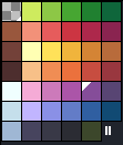
- Don’t be afraid to make transition colors between two tones or anything else you might need or feel limited by not having. Also don’t be afraid to use colors from other tones (like using the dark yellows as your bright browns) or making colors that are less or more than your predefined amount, should you need to. Here’s a screenshot of my very own palette that I made using these steps:
(wow this turned to be a wall of text)