I’m trying to do Mr Mislav’s lessons on Udemy and I am confused with this part, TBF I was already confused with the colour stuff from previous lessons
Not sure how to do this, it’s for platformer tilesets and the like
I’m trying to do Mr Mislav’s lessons on Udemy and I am confused with this part, TBF I was already confused with the colour stuff from previous lessons
Not sure how to do this, it’s for platformer tilesets and the like
When you’re starting out with pixel art, making your own palettes can be kinda hard and even overwhelming. This is why I’d recommend using other people’s palettes at first - there are tons of them at Lospec (Palette List), and seeing what makes them good, thus learning from them.
If you still want to give this a shot, I’ll try to explain my process of making a palette. I don’t know Mislav or his tutorials, so this might differ from his methods.
(wow this turned to be a wall of text)
To add to BloodRaven’s post:
Changing the hue for the darks and lights is called “hue shifting”. You’ll generally want to pick consistent hues for this. The hue your lights shift towards will read as your light source’s colour, and the hue your darks shift towards will read as your ambient light colour. It’s common to use a warm main light and a purplish ambient colour because these work decently well in most scenarios a game will have, which saves the artist the trouble of making differently coloured versions of the sprite for each location.
Try to think in terms of ramps, your various colours going from dark to light. To have fewer colours and give your art more unity, try to have these ramps intersect. For example, a deep orange could be a mid-red, and the darkest point of each ramp might be the same purple. When designing palettes, it helps to work on a canvas where you can have the colours arranged in these ramps, instead of just a swatch list.
Consider what you’ll be drawing with your palette. Larger sprites generally need more shades of each colour to look smooth, and the darkest regular shadow doesn’t need to be as dark, while smaller sprites generally can only fit fewer shades and generally need greater contrast (usually darker shadows) for the colours to actually be readable. 4-5 per ramp is a good number for large sprites and props, but is too much for 16x16 sprites, for example, where 2-3 is usually all you can fit.
Don’t be afraid to push your hue-shifting. It’s perfectly fine if in isolation, your darkest green looks dark blue and your lightest green looks yellow.
Don’t create palettes in isolation. As soon as you have a few colours, sketch a mock-up with them, and test test test everything. Know what you want to create with this palette, and test it in an appropriate scenario. You can also recolour existing art using the palette, but make sure it’s art that fits your use case. An inappropriate test context will lead to palette decisions that won’t work in your intended context.
I tend to have smaller palettes than BloodRaven’s example, and this is my general approach for those:
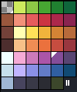
Here’s a palette that was designed this way, at step #3 and then finished (except these are rotated, so the black and white are on the sides rather than top and bottom):
![]()
(Well, not exactly step 3, as you can see the 2nd lightest and the 2nd darkest colours are already the same for all the ramps. This is because I knew I wanted them to be shared by the ramps.)
![]()
In this one, I also moved the whole blue ramp over because the pink and purple were very similar and I didn’t like how the blue, which I was really using as a main colour, was in the same location as the shadow colours for the other ramps. Notice how although my shadow is blue, my blue ramp goes through purple and green shadows, and how the orange ramp goes from a dark orange to green with no transitional hue. These are “strange” decisions, but they work well in the context this palette was made for, which is why it’s so important to be testing your colours constantly as you work!
For larger palettes, my process is more like BloodRaven’s, except I tend to arrange my ramps on a canvas and they turn corners or arc because I want them to intersect. For very large palettes (more than ~40 colours), I tend to not pre-design the palette at all and just make some assets and add what I need, and reuse colours as I go.
Just stumbled on this post and I just wanted to say thanks for the clarity and completeness.
I’m struggling to get colors right but this helped me a lot! Cheers