1 Like
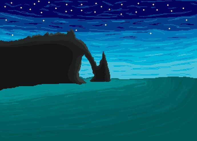
The art is really good, my recommendation to here is: add shadow to sea. It doesn’t make sense that sea has light color when there’s a mountain next to it.
If you use the squint test you can tell the sky has a lot more color and brightness variation than the water and rocks… If something doesn’t pass the squint test it probably is a very flat image.
i love the sky!
personaly i would prefer less stars, or at least a variation of some bright and dimmer ones, but the colours of your sky and the gradient, i love them
