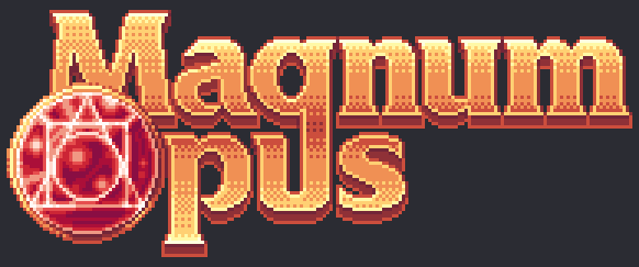
Here’s the final version, after consulting with my teacher (and with all of you guys, here and on discord <3)
-I toned down the saturation on the gold and fixed darker values.
-I replaced the glow with a gold trim, that helps better combine the stone with the text and hopefully make it a bit more readable.
-I made the gradient on the bottom letters a mirror of the top one (mostly noticable in the “p”)
The gem itself could also serve as a nice icon for the game and could be used as a logo on its own :3
 . . . . . . . . . .
 ![]() . . .
. . . ![]() . . .
. . . ![]()