Main Character for a game I'm working on

Been working on a little game for a while, and recently I’ve tried updating a few sprites as my comfort in using Aseprite grew. My first post in here, hope you like it!


I appreciate any constructive criticism, I have been an artist for years but only got into pixel art very recently. (And I’m colorblind so any tips about color would be greatly appreciated!)

1 Like

Hi @cybervaqueira,

I’m more a script-writer than an artist, so there’s not much general advice I can give you. I’m not color blind either, but on the topic of color tips for artists with color blindness: I recommend that you specify what kind of color blindness you have when soliciting advice, esp. on the Internet.

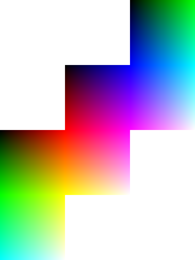
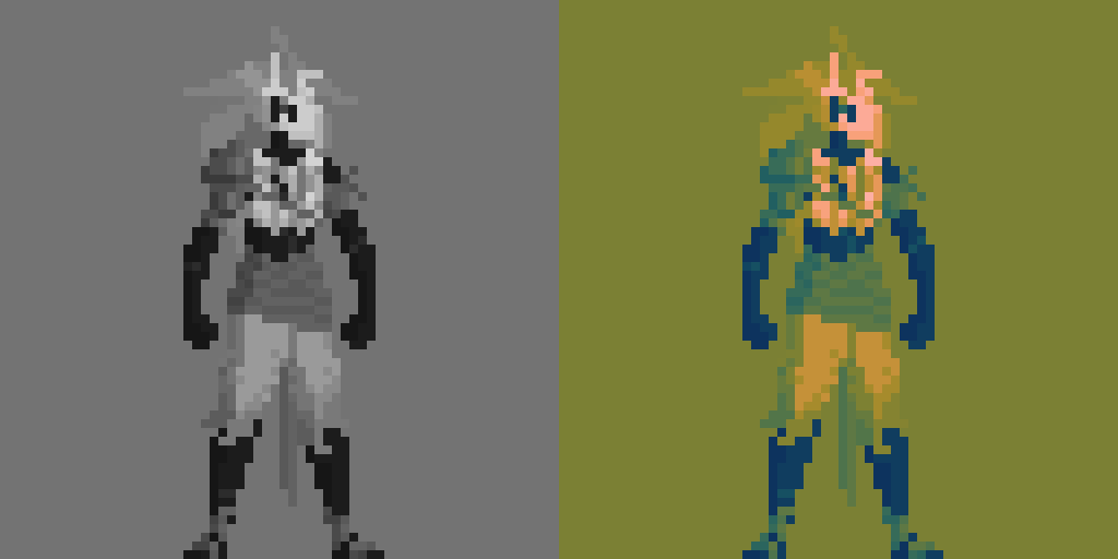
There are color blindness simulators online, and while they’re probably not 100% accurate, one like this could better inform any responders to your question. From what I’ve seen, they list roughly 8 kinds of color blindness. For example, this image of an unfolded sRGB color cube

looks like this with the red-weak protanomaly setting.

Another reminder I find useful myself: Plotting a palette may help you visualize relationships between your chosen colors. However, color wheels and color plots are similar to cartographic projections of Earth. To achieve a desired 2D geometry – usually either a square or a circle – information from a 3D color model is either distorted or omitted. For example, here is the palette from your image in an animated plot from SRLAB2, first from the top-down, then from the side.

cybervaqWheel2 cybervaqShades2

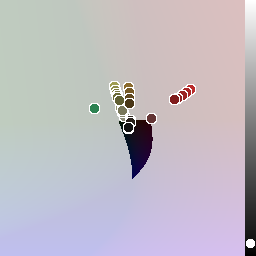
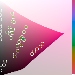
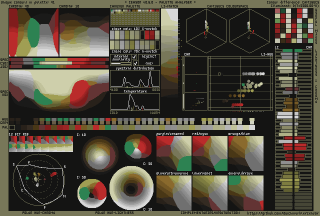
Below is data generated by Censor.

plot

There’s a limit to how much these could help with, say, identifying color harmonies for hues outside your range of vision. Even for normal vision, relationships between hues aren’t as standard as intro color harmony tutorials make them out to be. All you have to do to poke at such discrepancies is to ask what the complementary color of red is. You could also compare historical color wheels, such as the ones at Public Domain Review, with the color wheel built into Aseprite.

Lastly, Fabio Crameri has palettes that I’ve found helpful. They are issued in the context of presenting scientific data. Even if the palettes are not useful for art directly, they might be interesting, for example, when proofing an image’s contrast and brightness.

Hope that helps,
Jeremy

2 Likes

@behreandtjeremy I have to admit I don’t really understand everything you just said, but the fact that you assembled such a deep and interesting little research on how to help me with my colorblindness is just amazing! I’ll definitely study it a bit more throughout, but this is a really nice bump into the right direction. Thank you so, so much!!!

2 Likes

Try to define the shape of the face more… Also I would like to see this figure animated if possible…

@David_Z123 Still going to be a few weeks before I dive into animations, as I’m going through a very creative month so I’m trying to make as many designs as I can while it lasts.

What do you mean by the shape of the face? You mean the silhouette or the mask having more contrast over the hair?

Yes, add more contrast. would help show where the facial structure ends and the hair begins. You could also make the cheeks bones more angular if you are trying to make your character to have an undead appearance.

Oh, that’s not his actual face, it’s kind of a mask that’s stuck to his face. I’ll try to add more contrast, looking at the monitor sometimes hurts my eyes and I have a lot of trouble with color, but I’ll see what I can do about his collor pallet. Thanks!


Do you think it looks more like a mask and with more contrast?

AraraRework
Here is the rework for your character Arara, please notice the changes that I did to it…

It’s definitely a change to the concept, I don’t know if it translates well the vision I have for the character, but I’ll keep your point in mind. Thank you for you help!

AraraReworkenlarged
I know this is your Character, I got it… I just wanted to show you how I defined the shapes of your character and used added contrast to make the character to really come alive. I gave the mask a well defined shape that one could easily recognize no matter the size of the image of the character. This is what I was trying to explain to you. I added specular highlights to the arm guard making it appear like it was made of copper or brass. I outlined the pants with a darker green and added a shade lighter green to make the pants appear more cloth like. Arara’s body proportions are perfect though, and I often struggle with proportions when drawing the human body. So, excellent job on this…

1 Like