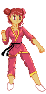
And the Basis was a Draw on a Grafik Paper like this:
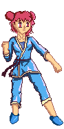
And the Original Art was this:
So, what do you think?
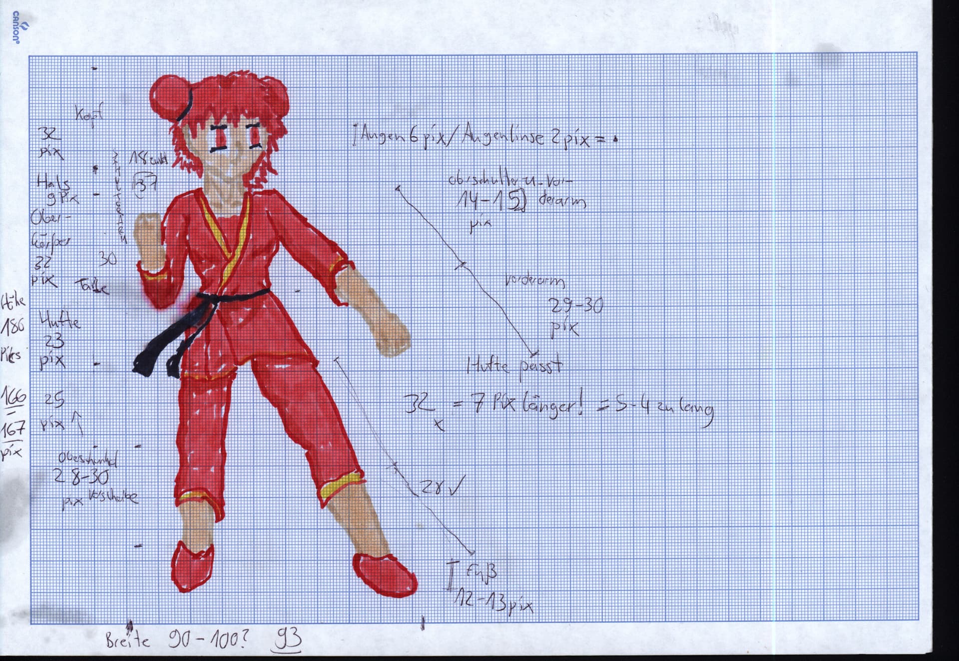
And the Basis was a Draw on a Grafik Paper like this:
And the Original Art was this:
So, what do you think?
there are a lot of jaggies and over all extra unessesary pixels, you see pixel art is not the best media for small details so even if clothes would fould like that once wearen is better to smooth it over to convey better the shape, over all shape over details, the outline sohuld not be interrupted most of the time
It’s still not Perfekt, but you have a Point!
But what I don’t Understand is, that the Outline was Interrupted?
When you see the First one, that all only the Outline and it was not even one Interruption on the Outline!
It is right, Pixelart are not Good at small Details, until you have a Bigger Picture but more Work that means…
When a mistake was made, a Reason is the Hand Draw Picture has it too.
But you can see easily it Fixed that I see.
So, it’s not still ready…maybe Today…
And thanks for the Komment!
![]()
![]()
![]()
I really advice you to look at some basic tutorial on how to pixel art. Mortmort has some great begginers explanations on the pixel art rules.
You should have a look.

even in the biggest pictures you still have to work on the same fundamentals, you have to prioritize shape than details
I have already seen some Pixel Art Tutorials.
But use not all Tipps yet…
Do you also mean Anti Analysing?
The question is, how to do that on my Pic?
Not quite Sure…
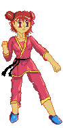
Have also Updated my Art a bit!
Here a link on my Video on Youtube:

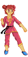
Here is my New Art with Blue Clotes!
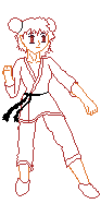
No, i mean this:
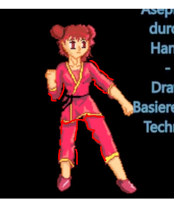
See how you line is interrupted MULTIPLE times everywere, you may think thats just doing the folds, but Thats not how it works on pixel art
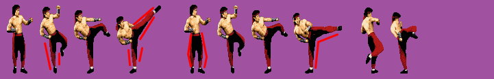
Heres a example of mortal kombat:
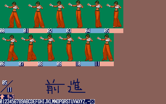
Another from street fighter:
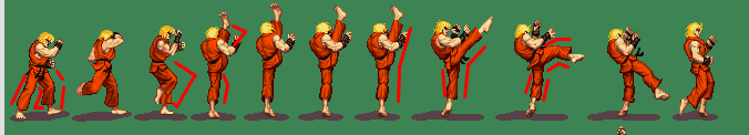
The outline is interrupted only when the shape under demands(kness, thighs etc) it flows alway in a clear shape
Thats what i mean Shape > Detail, even if a real kimono would have these folds, you should prioritize clear shapes, only sacrificing when its of absolute need.
Those fractures in the line create visual noise which is terrible for the viewer experience, remember we pixel artists work with a limited amount of information that can be transmitted to the viewers, so we its alredy bad enough without the visual noise, we need to make each pixel value as much as possible.
i do want to congratulate you on the color choices on the blue version, much better than the red palette.
these sprites were taken from https://www.spriters-resource.com/
its a sprite dump from various games, if you need to check a style or reference take from there.
Okay, I see…
I thought at first, but that was a misunderstanding for me.
That can also mean, Clear Silhouette, because that has to do with that, what you mean! ![]()
Still, I have seen some times, that were a bit the line Interrupted, but not much as my Sprite…
Finally, I see this! Thanks a lot! ![]()
![]()
The blue version was Originally Planned but on Drawing I forgot this…![]()
![]()
Very Nice Tipp you Show me!
Now, I Share also a Game that was canceled, but this Year they have Drop it out:
Garou Mark of the Wolfes 2 a New Charakter was a Female Disciple from Joe Higashi!
Enjoy! ![]()
![]()
![]()
![]()
![]()
![]()
![]()
![]()
Hello!
I’m back and want more Share my Sprite Toughs!
I don’t give up High-Performance Big Sprites like the best of back n the Day!
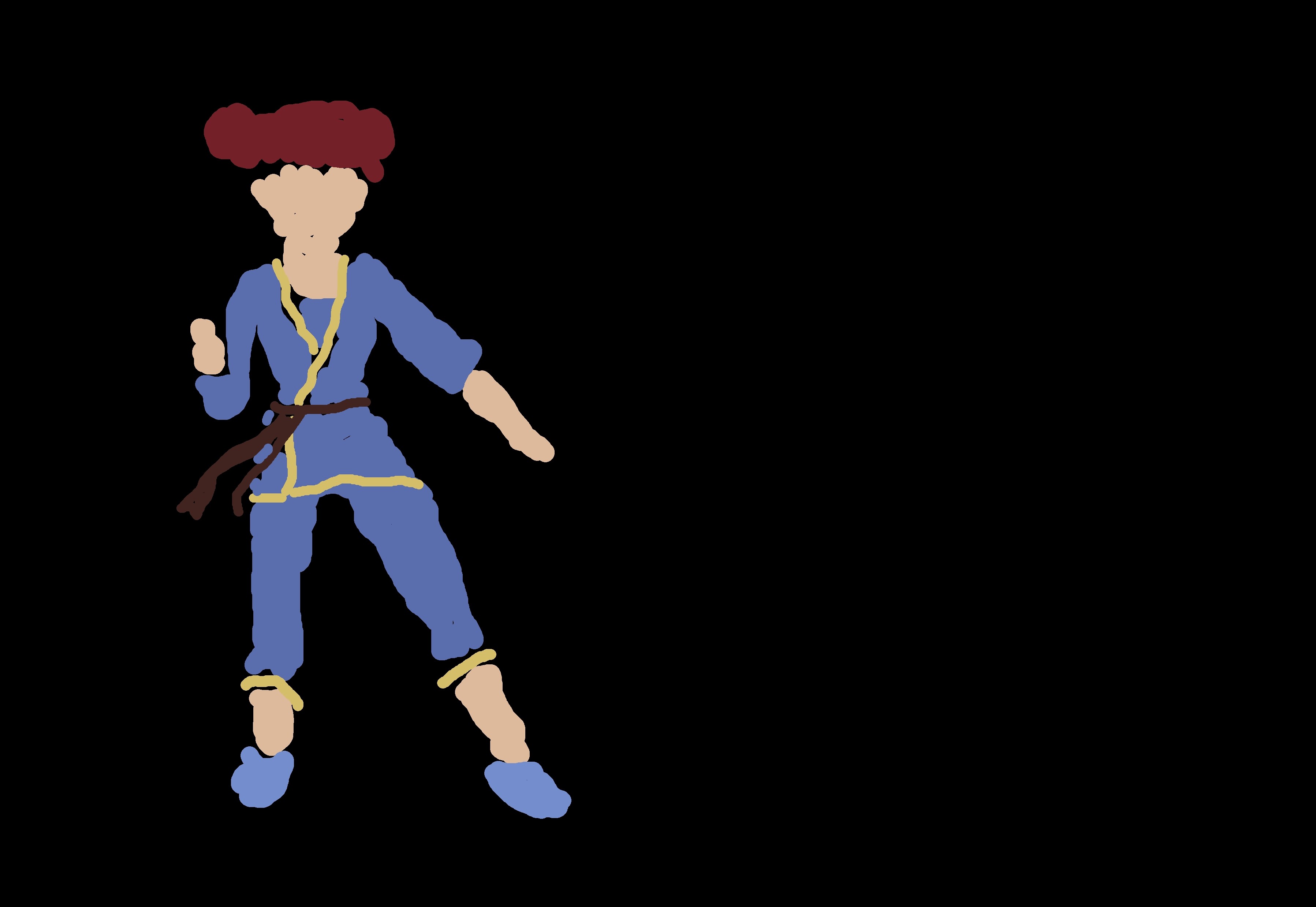
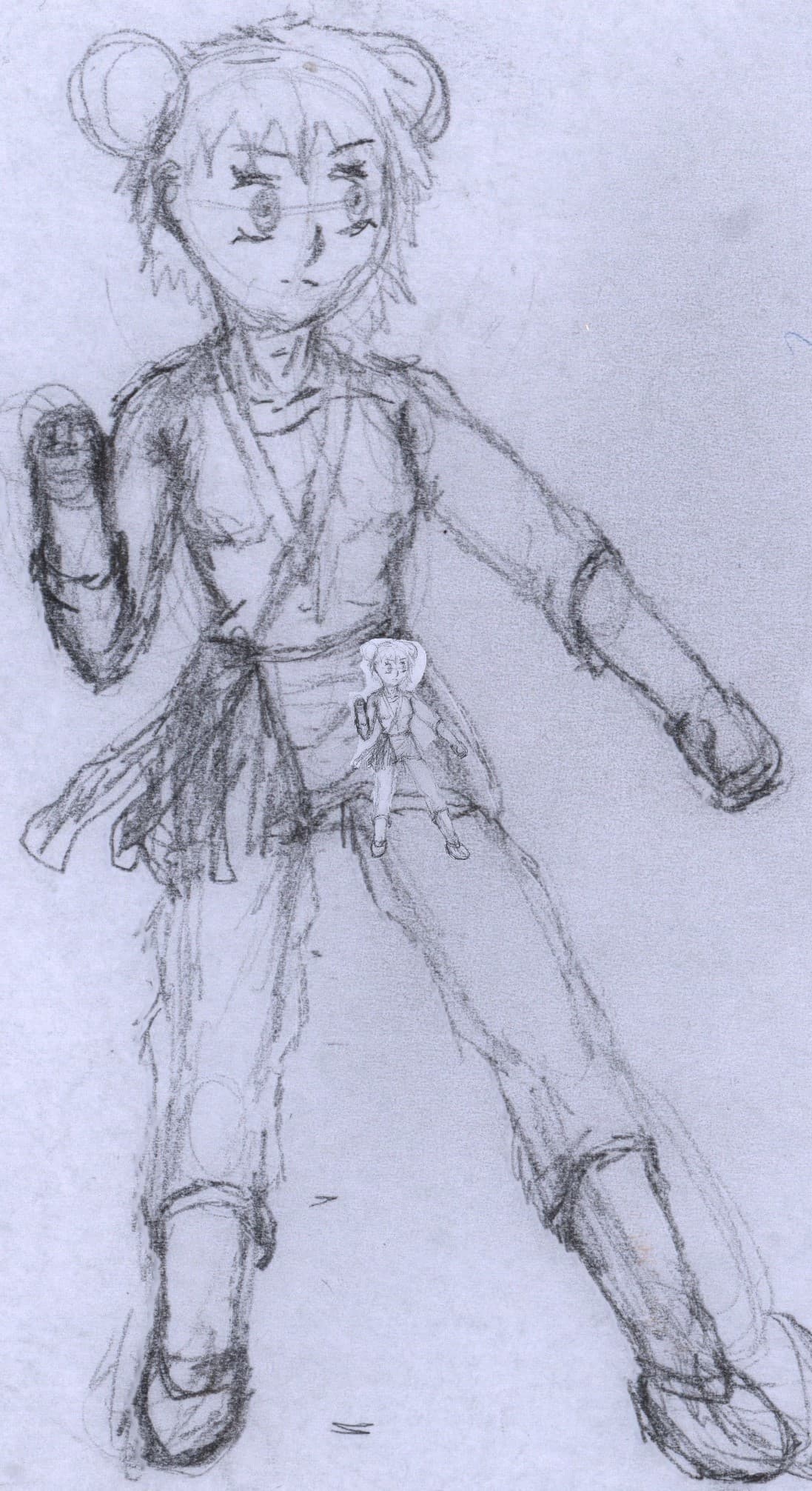
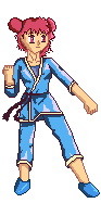
So, here first up my Charakter, that I was working bevor and Fix up issues!
Before:
After Fixing:
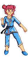
Still not Good enough but it’s a bit better!
What do you think and how can this be better?
I have also tried new techniques or Ideas, but don’t work by now…
High-Performance
Idea was, that all-around build-up, but you see how to start was not so sure…
Next like a Hand Draw Position in Sprites, then Animate all around…
But I felt like Hand Draw Charakter must be the Sizes and look like the Charakter to the Finish, but the same Problem, that this will not see like the Charakter very much…
So what the Community think to my Idea or try to make Good Sprites?
I think it is good that you are trying to make a character as that can often be a good way to be creative. I think it would be good to have references to other people’s characters and realize as much as you can about the techniques people use to make pixel art look nice.

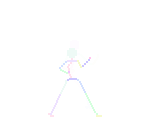
Here is a smoothed-out silhouette of your character I created so we can see what it looks like without the color and lines. I think something is lost between the silhouette and the colors. One of the things I would suggest is to try and bring back some of the smoothness and also try looking at your character without saturation because then you can see how bright everything is, instead of having such bright colors a palette with nice changes in brightness would help the contrast:
Two of the videos I would recommend for future reference on character design are from AdamCYounis and Saultoons.