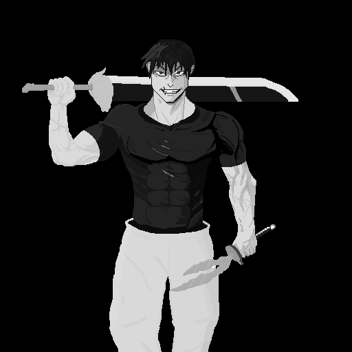
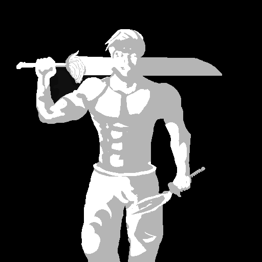
Moreso workflow advice here, but when working in greyscale, your contrast and shadow direction are big focuses… If you squint your eye and it all blends, you likely need better contrast… If you can see shadows going all over the place, then the shadows might need adjustment.
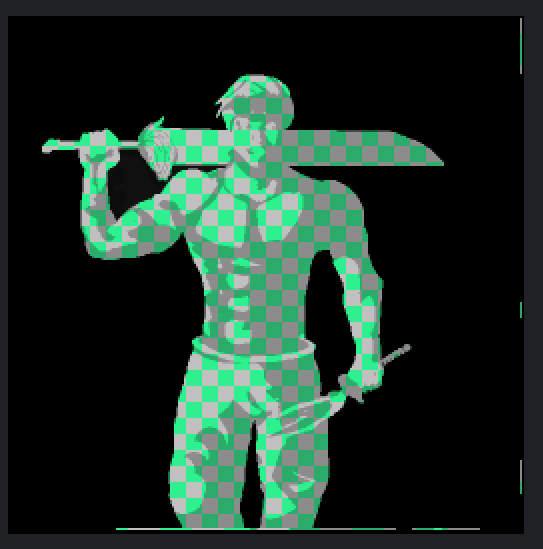
I think as far as contrast, the stage, right arm, and shoulder could use a bit more of it… You did a decent job on the face (although I think there is a shadow on the side… is that from the sword? Anyways, loading your image into Aseprite, you can see how many colors you have used.
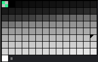
Typically, a pixel artist uses 4 to 32 shades to allow for easier, more precise pixel placement.
I took a palette from the VGA 13h and reduced it down to just the greyscale part near the beginning to get this.

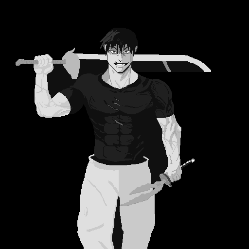
If you turn on under Sprite > Color Mode > indexed mode, the program will turn the image into your chosen palette (with varying results; I think the program has reduced your fine detail too much in this case). [If you choose to try it out, make sure it’s on RGB mode again when you want to add colors]
Still, the point here is more about how you can use a palette to get similar results without that many colors. I think the shirt detail would be easily replicable using the new palette, using a color closer to the highlight in the hair to make it pop out more…
Btw, one upside of using a smaller number of colors is that it makes it easy to select via the magic wand and draw within the shape of that color.
As far as shadows go, there are the shadows that are between two parts of your subject that are touching or close to touching, which is called contact shadows (e.g., shirt sleeve casts a shadow on arm, head casts a shadow on neck, hand and sword handle cast a shadow on each other)
Then you can emphasise the main directional shadows and highlights based on one consistent direction… did you use a reference? The shadows look different depending on the subject’s form(bumps and ridges) as well as the art style.
If you are lazy, you can use a layer set to multiply and change its properties, adjust how dark to make quick shadows by using the layer’s opacity. (side note: having separate layers for background or different objects is handy if you didn’t think about that already)
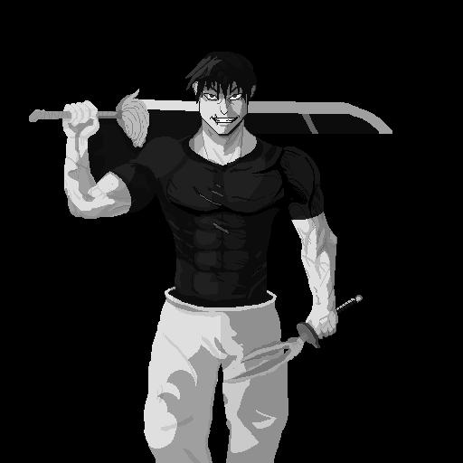
Overall, really impressed with what you have managed to do here, the small details, and replicating the character pretty accurately. Well done!
Thanks a lot for the advice I will take for the future. I drew this to learn how to draw muscles and work in black and white, but as for pants and a knife, I got tired in the end and simplified everything very much.