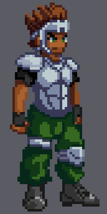
I’m a beginner when it comes to art in general, but I was hoping to make some animations with this guy, and seeing the amazing feedback I’ve seen come from here, I was wondering if some were willing to help me improve this guy. I was going for the game:
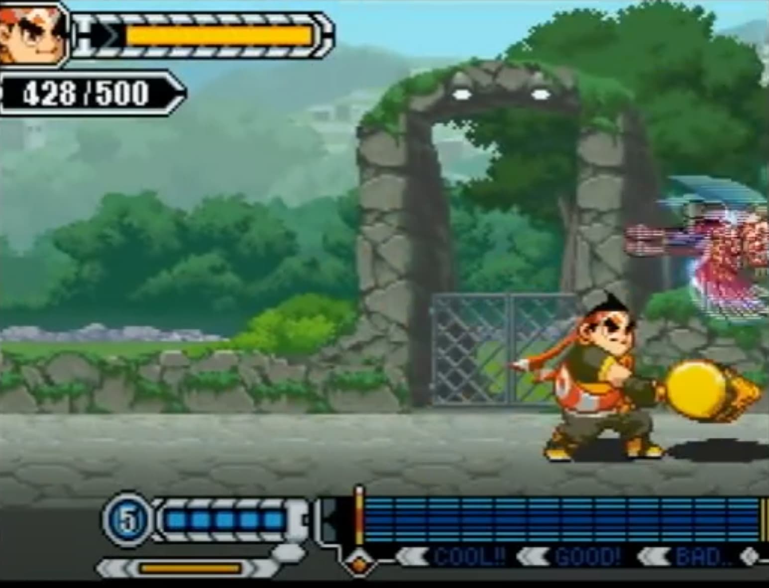
Draglade’s style character for reference if needed
Thank you in advance
Edit:
I tried some animating, it’s just an idle stance for standing and talking, but hopefully in the future I can do some more dynamic things. Again any feedback for improvement is welcome. Thank you
You can see that this hammer character, when you squint, is somewhat the shape of a pear, providing a clear design language. So, if you tried to animate it, it’s easier to have the head move separately by representing it first as two circles on separate layers, moving independently. This same idea applies to other characters which reminds me of a pixel artist’s workflow that I saw on YouTube.
So I found you a youtube video playlist to search through for relevant information on making characters and animations. My first choices would likely be: getting started with animation, nailing those details, character heads (, Maybe character design with commentary?), and finally: attack animations.
Anything past this point is just extra useful information…
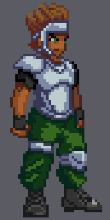
Thinking about your character is a very helpful step. Who is your character, a fistfighter? A swordsman? What is their name? Job? I consider your current character design to look most like a sharpshooter because they aren’t wearing anything to protect their arms.
I think there need to be more indicators about who the character is E.G. Tattoos, markings/scars, Symbols of origin or a company. So you will want to put a good chunk of personality into their outfit and fighting style.
Use plenty of layers for the pieces you want to move independently like a bandana ribbon. You will still want to change each layer when the perspective should change so having a separate layer for the face and helmet piece may or may not be a good idea.
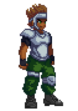
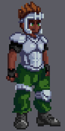
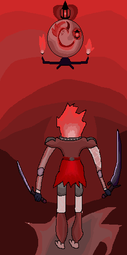
I made some modifications to your pixel art. I adjusted the hair, made changes to shapes, and simplified some elements. I noticed the character’s jaw seemed slightly disconnected (just super sharp, likely from perspective).
Additionally, I removed the floating hair bits as they don’t work well at this size, unless you are skilled at tweaking them.
The light direction feels a bit weird when it comes from the top right and doesn’t hit the back arm or the right side of the left(character’s right) leg. A thing called ambient occlusion is useful where you can estimate where shadows should be by finding separations between objects (E.G. typically in between breasts or the abs of armour there is a groove of some sort).
Here I show this technique off a bit by having there be a separation between abs. (hair is closer to the original for this image for variety)
But since it is a bit harsh of a separation I added light to the left side as well then made the separation lines a bit lighter.
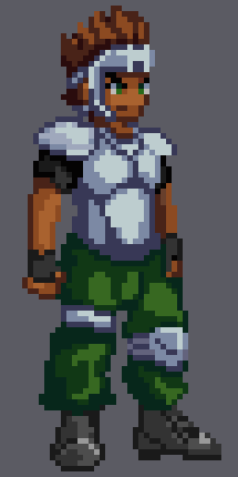
The last image with interesting color choice and altered hair:
I know I made some interesting choices for editing and I know I made a few mistakes. I hope any of the information or videos were useful. I wish you good luck! You can use any of these edits as references or for any purpose.
Wow, I really enjoy the way you rendered out the armor, I will definitely have to rework the armor. I was unconfident about the shading and light direction, so thank you very much for helping to guide me there. I really appreciate you rendering out so many different changes as well.