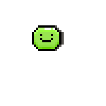
I’ve been experimenting a bit with shade and I’m not sure if this is too much shade or not enough shade:

- Good as it is
- Add more
- Add less
0 voters
I’ve been experimenting a bit with shade and I’m not sure if this is too much shade or not enough shade:

0 voters
#help is for asking for help with Aseprite, it’s not the place to get feedback on your art. #artwork is for that.
You’re using a lot of colours but they’re barely visible as different from the base green. Try making your highlights lighter, and your shadows darker. You also don’t need so many colours for a sprite this small, a single shadow and a single highlight colour would do just fine. The areas occupied by the colours are so small that you don’t really have space to make good use of finer gradations.
When shading, consider the 3D form of the thing you’re shading. Right now you’re just outlining around the edges, which gives the look of a flat object with a little bit of thickness, such as a button. The shadow the blob is casting on the white also seems to correspond to this, making the blob look like a button lying on a flat sheet of paper, rather than a 3D object in a 3D environment.
Here’s a quick redraw with fewer colours and an attempt to make the blob look a little more 3D. I use the position of the white highlights in your original as a guide for where the light is coming from (top right front).

Thanks, I knew that there was something off about it