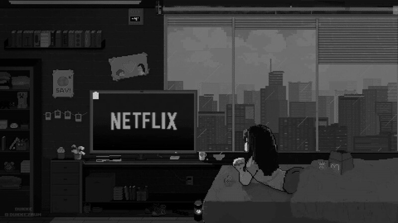
Hey guys, this is one of my first pixel art pieces, what do you think? T-T
Hey guys, this is one of my first pixel art pieces, what do you think? T-T
I like the scene and find it interesting that there seem to be a lot of gradients which feels a bit less pixel-art-like. (though it could just be the video export method)
Does your character have a name?
Do they have an eye color? (if so it might look better than just black?)
If you would like some thoughts from an art-based perspective then I think the character’s outline might look a tad better if it were a color other than black.
(E.G. darker skin tone)
As far as colors go in the scene, the color scheme is very dark minus the small white piece on the TV. This is a good opportunity to highlight things you want the eye to focus on with brighter colors. (like what you did with the glowing logo) It also would be useful to add colors from the environments(E.G. Netflix logo[red], general TV light[whiteish grey], sky [blue])
Is this your second artwork specifically in Aseprite?
I like the little head turn on the character, though I do wish the hair had more shades to it.
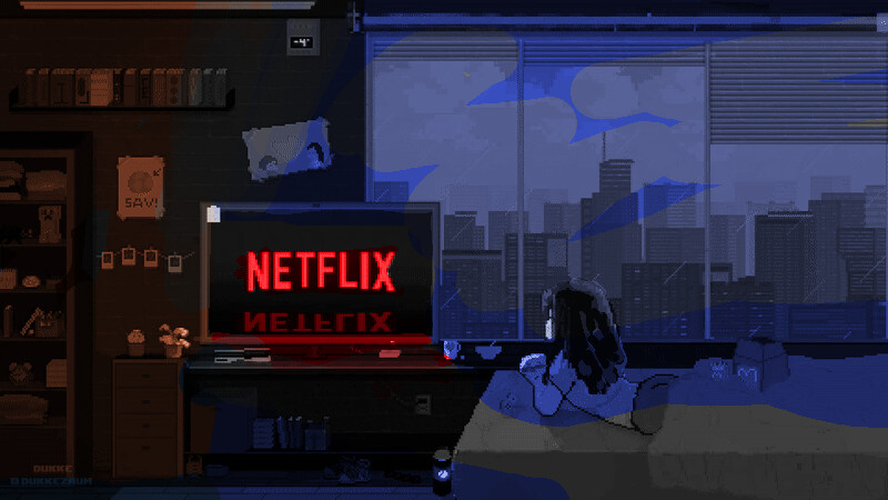
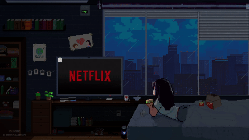
If you create a desaturated version of your image you can see how dark things are and on my screen at least there is way too much dark to read the scene reasonably… So I used an overlay layer to show areas I feel like should be more tinted(not to this degree though.)
Once again I like the level of effort you put into this and the little details! Just think it would be nice if I could see them a bit better.
What are your thoughts? I didn’t have a lossless image to work with so this is the most reasonable result for illustrating my points.
Your responce is so detailed and thoughtful, I really enjoyed reading it ![]()