I’m curious, could you say more about this? Maybe even post an image comparing what you see in Aseprite to what you see in other programs.
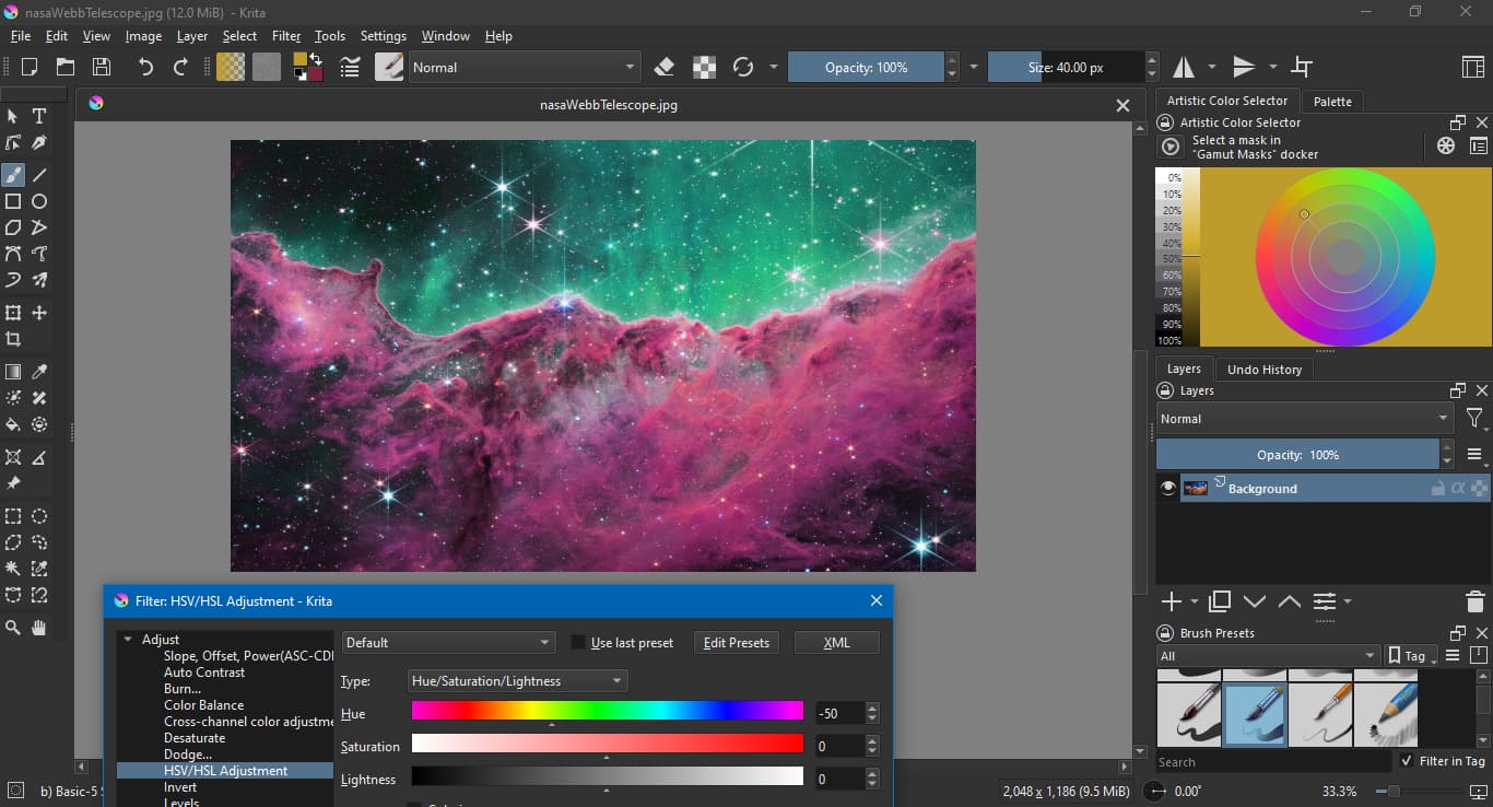
As an example, I took a test image from the Nasa Webb Telescope and did a comparison of what a hue shift by -50 degrees looked like in Aseprite, GIMP and Krita.
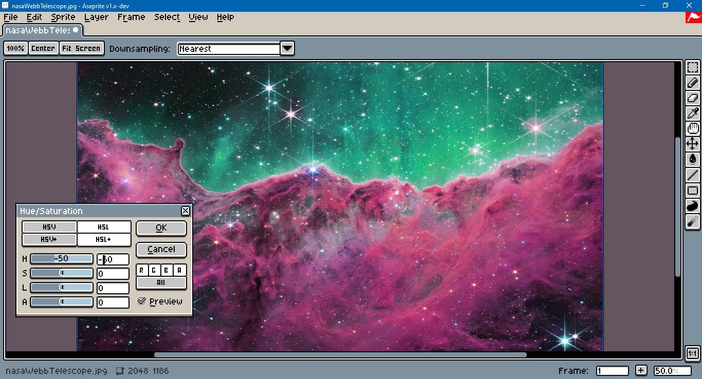
![]() The built-in HSL adjustment.
The built-in HSL adjustment.
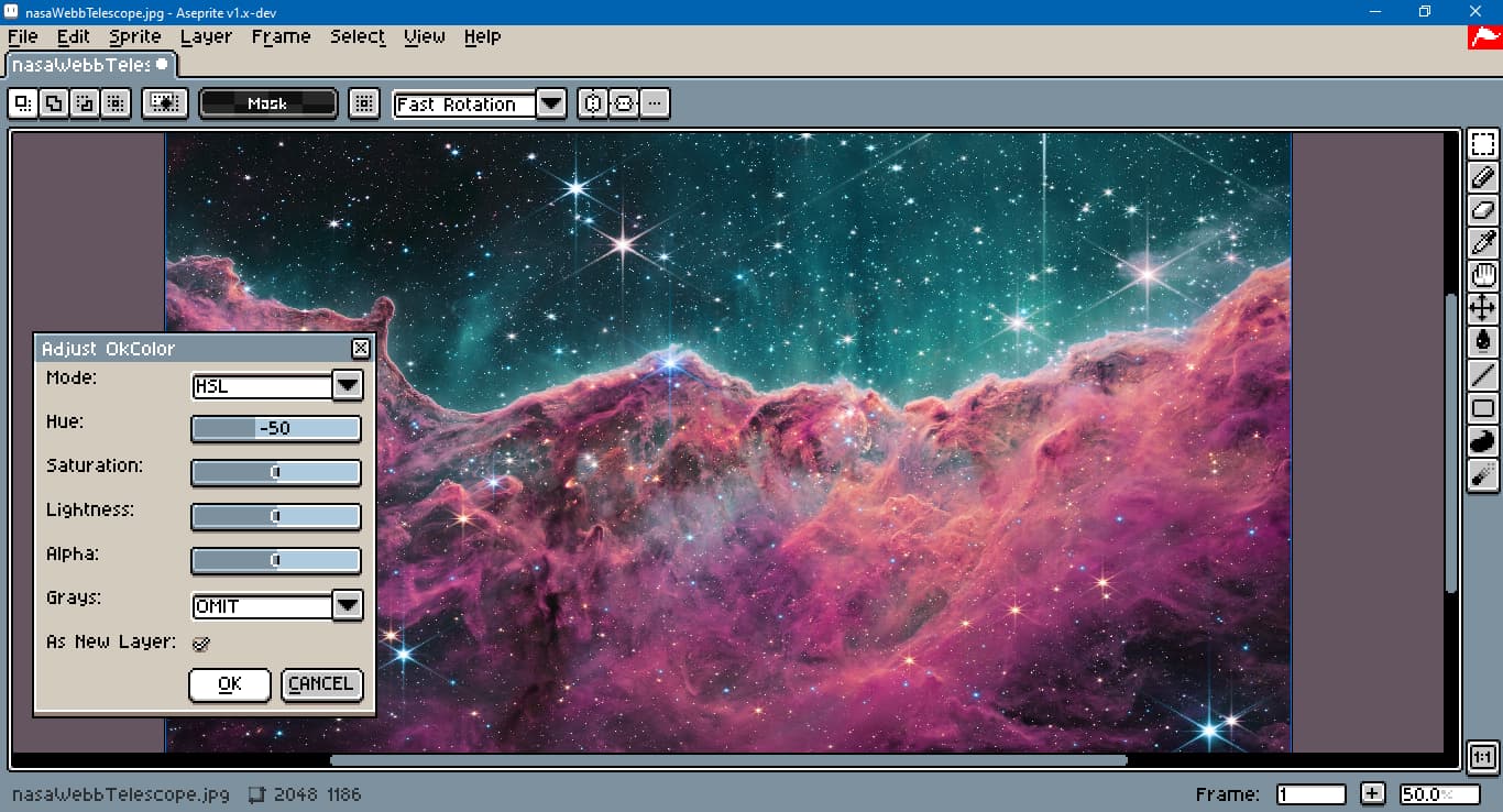
![]() Custom Okhsl adjustment.
Custom Okhsl adjustment.
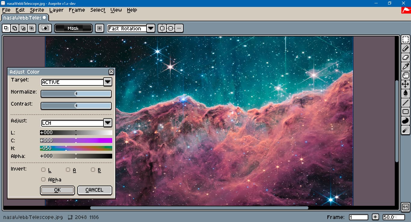
![]() Custom SR LAB 2 adjustment.
Custom SR LAB 2 adjustment.
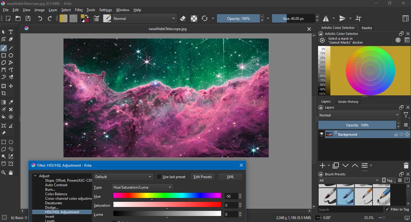
![]() Krita, using Luma, not Lightness.
Krita, using Luma, not Lightness.
![]() Krita, HSL.
Krita, HSL.
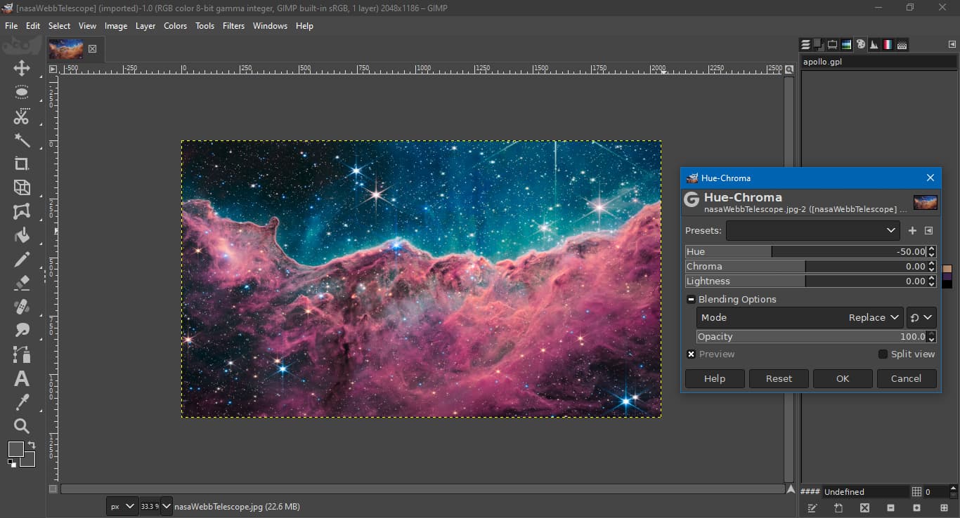
![]() GIMP, LCH.
GIMP, LCH.
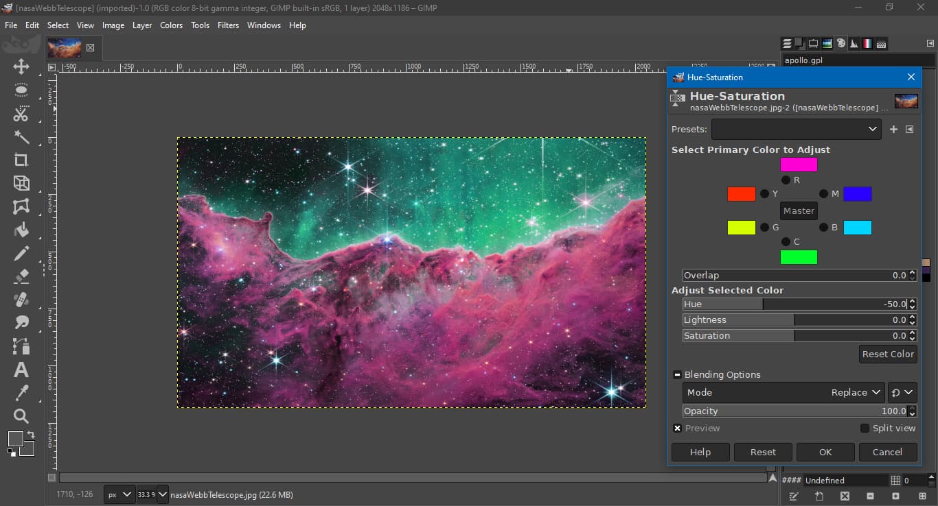
![]() GIMP, HSL.
GIMP, HSL.
I used a hue adjustment only because for the custom SR LAB 2 and GIMP LCH adjustment, saturation and chroma adjustments are not exactly comparable.
Saturation is a percentage with a known lower and upper bound. Chroma is an absolute value with no strict upper bound, just a practical one, for example dark blue can reach around 135 chroma. As a color’s chroma increases, it’s more likely it will go out of gamut. The fastest and easiest way to deal with this is to clamp each color to gamut, which distorts its hue. A costlier approach would be to use some kind of tone mapping.
Results may also vary based on the working color profile used when making the adjustment, for example standard RGB vs. Adobe RGB.
If you want more background, I’d recommend reading the “Disadvantages” section here:
and the “Lightness in different colorspaces” section here: