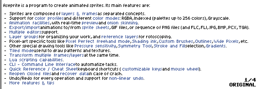
In Aseprite v1.2.40-x64, the whitespace in the README could be improved.
Throughout the text, many words seem to have too much or too little space between them, making the content hard to read.
-
The space following most links appears to be missing, so the next word immediately follows the link text. For example, the first bullet item contains what looks like “layers & framesas separated concepts”. There should be a space between “frames” and “as”.
-
There should be a space after commas.
-
Spaces inside link text should have the same 3px width as spaces outside of links. Currently they appear to have a 5px space, so the link text in the first bullet item looks like “layers & frames” when it should read “layers & frames”.
Here’s an animated GIF showing how the text would look with these changes applied: