Request: Alternate Lock Icon for toggle 'on' state

Hi @dacap, I have a small UX request.
Can I have an alternate icon for the lock toggled ‘on’ state, plz?

As you can see from the image below - the icons for show / hide layers, or the continuous / discontinuous states are very easy to grok when one has many layers, as seen in the example layer image. But spotting locked / unlocked layers is always an extra effort and a bit of pixel hunting (refer “A”).

feature

I have a suggestion - refer “B”, or use anything that is a bit more easy to differentiate or have different silhouettes.

Thanks

1 Like

While I definitely agree that the icon needs to be made easier to read, I don’t agree with this specific suggested replacement. A faded-out lock, to me, doesn’t read as “locked”, it reads as “the locked state cannot be toggled”, since it’s usually disabled buttons that are usually faded out.

Perhaps a brush and a broken brush might be better? Or perhaps the padlock body can rotate, like it’s hanging by the shackle?
image

2 Likes

HI there! :wave: this is a good idea, not sure about the icons yet (the gray icon is already used when a group is locked, so children layer are displayed with a grayed icon).

One possibility:

image

1 Like

I think red draws too much attention to itself D: There needs to be a clear distinction between the icons when you’re scanning down the list, but they shouldn’t be distracting when you’re doing something else.

2 Likes

Sir, I appreciate your comment. I shall leave it up to you to make the best judgement call on which direction to go with
Please and thanks :slight_smile:

1 Like

Oh, I actually came here to make a post just like this.

I’ve actually made a modified theme that fixes this issue. It’s similar to how @devilsgarage did it. You can download the whole thing here: Aseprite Theme - Lock Mod by jamesO2

Here’s a sample:

Squint you eyes until the whole GIF is a blur, and tell me which one is more instantly readable.

I’ve changed the locked and unlocked icons to be more visually distinct (unlocked is much more clearly an “open lock” as well as horizontally shifted to not be perfectly aligned with nearly identical locked icons). Locked layer icons are ALWAYS black (high contrast, very visible), while unlocked layer icons have low-contrast (less eye-drawing). But when you have a layer selected, the icons are always clearly visible (high contrast WHITE) in order to highlight them.

The same rules apply to the hide/show eye icon too – just to help make them more visually distinct at-a-glance. I’ve been using this theme-mod myself for a few months, and I no longer ever struggle to tell at-a-glance which layers are hidden or locked. It works great! I did a lot of testing to tweak this design perfectly to be human-friendly.

From a design standpoint, you should think of the lock/unlock icons not as two different graphics of a lock, but as two states of existence – “empty” or “full” – a locked layer is “full” thus solid, while unlocked it is “empty” (lacking lock), thus the graphic must appear “empty.”

This same logic is already used on the Cels icons (black circles for “full” cells, grey empty cells for “empty” ones). Imagine if the Cels used nearly identical black circles, with a one pixel difference (like the old lock icons) – they’d be unreadable.

I would really love for this to be integrated into the next release, but I’m also fine just using my modified theme too. But I feel like I’m not the only one who has wasted a lot of time visually scanning the program trying to find which layers were locked – so this should probably be addressed soon.

Also, yeah, red is a terrible design choice for the locks. No offense. The icons need to be visually distinct (high and low contrast), while also visually meshing with the theme. Not to mention adding red into the UI is distracting (as it clashes and violates a ton of basic design principals).

I tried experimenting with different colors as well (red, blue, green, etc), and all of it clashed and violated the design philosophy of Aseprite’s UI. And truly, Aseprite’s UI is my all time favorite UI of any of the programs I use. It just feels right! (minus this one little issue with the locks). But with with my tweak it feels perfect.

EDIT: I also forgot to mention, there is a modified version of the dark-theme included here too,

5 Likes

JamesO2, you beautiful son of a gun! I love it! This is exactly what I wanted -
The UX on this lock is soo readable with the open lock and, very clear silhouetting between the locked and unlocked states that I dont have to think twice.
It’s been a few minutes of working on my multilayered file and it already feels so much more easier to navigate.
Happy to support your project, goodies coming your way.
Cheers!

1 Like

Hi there! @jamesO2! yeah not a big fan of the red color (which doesn’t match the current theme). About your change, and don’t quite like the “disabled” look of open locks (which generate a little of confusion, because it’s unlocked but it looks disabled), but I really like the new look of the open lock. I’ll experiment a little more about this.

1 Like

Hmm. I do see what you mean. I checked a file of mine that has a lot of Layer Groups, and the disabled lock icons have a similar grey-ish color. I think I may have missed editing them when I designed the theme modification (or are they colored Disabled using code?)

But here’s the thing though, I’ve been using this modified theme for a few months now, and I honestly haven’t had any confusion, and didn’t even notice the grey-ish colored disabled locks in Layer Groups. So ultimately, even if a design is “inconsistent” what is more important is that it is “human sensible.”

For example, when Apple Made Their Shuffle Feature Less Random, to Make It More Random. Sometimes hard-logical True Random “feels repetitive” – because if a song repeats 6 times in a row, technically that is still “random” from a mathematical perspective, but to our odd human perspective it feels “wrong” and “not random.”

And so at some point a change was made so that when you now press shuffle, the list of tracks is reorganized into a new list to played one by one. That prevents the same track coming up repeatedly. It is less random, but it feels more random to users.

So Apple fixed a problem that was “technically correct” but still “felt wrong” to users. I think this Aseprite lock icon is one of those situations.

Yeah you’re right that the grey lock does “look disabled” on first appearance – but from my experience actually using this theme daily, for the past couple months, it hasn’t caused me any confusion thus far. It’s still much more readable, and it “feels right” when using it daily, and it saves me mental energy trying to figure out what the icons mean. And I’ve shared it with a few friends, and they also said it was an improvement.

The current icons both look like black blobs to me at a distance of more than a foot or so. One of the best things my high school art teacher taught me was the “squint test” – that any art piece should be fully readable when you squint your vision until it blurs, and nothing but the vague shapes appear. Here’s an example of the current Aseprite icons versus my modification:

(I used Aseprite’s Blur x9 filter to simulate squinting)

In the Default theme, you notice, the “eye” icon is very readable (you can still tell when it’s closed or open). The “continuous cels” icons are very readable (you can easily tell which is two dots, a long line, or a folder, even with very bad vision!). But the Lock icons are all black blobs. You can kind of tell which is unlocked, but you have to focus and really examine each icon. My sample on the right is instantly readable.

With my Theme, if I squint my eyes or look at my monitor from 6 feet away, the “black” lock icons represent locked, and the “not-black” ones are “not-locked” – it’s very readable and sensible, even from across a room at a glance – or for anyone who has visual impairment (near sighted like me).

Looking at another art program I use, Clip Paint Studio, this is what they do as well:

The “Eye” and “Lock” icons don’t have alternate frames – they are simply removed when not toggled, making the GUI very readable. There is no “unlock” icon, just “lock exists” or “lock doesn’t exist.” Same with the eye.

I think this is just the only real sensible way to do it. Its how other programs do it, because it works and is consistent with how human brains work.

To sort of demonstrate why this is such an issue for me personally, here’s a photo of my workspace:

This is me sitting about 2 feet from the display, with my hand directly pressed against the screen. I have a small portable tablet screen with 1080p resolution, and very High DPI display. So the pixels are incredibly small. In comparison to my fingers, or my pen, the icons are tiny. But the issue isn’t UI scale – this scale is actually very good for my workflow (my scaling is set at 200%), the only icons I have issue with reading are the lock icons, really.

Even if you squint at the Tools or other menus, they are still very readable!

You can tell exactly what each icon is, even with blurred vision. Very good design, very distinct.

I honestly love the GUI on Aseprite – its so good, and my favorite program to work with. It literally is only the lock icons I struggle with, haha. So I don’t want to give the impression that I’m upset or complaining, or anything like that. :slight_smile:

But now that you’ve mentioned the similar “disabled” icons, I might experiment with modifying my theme too. Even though it hasn’t caused me any confusion thus far.

Perhaps the “disabled” icons could have an X over them, in some fashion? Or maybe “disabled” icons could have some sort of symbol/icon that represents “the group this layer is in, is locked!” Not sure. But I’ll play around with it and see what I can come up with.

1 Like

Yes, silhouetting! That’s the word I was trying to think of. Each icon needs to have a clear distinct silhouette or shape. It’s super important in design, and the only icon I’ve found that has issues with Silhouette in Aseprite is the lock icon. All the other icons and GUI are pretty dang genius.

I wrote a little bit more explaining my though process, and why this is so important to me here: Request: Alternate Lock Icon for toggle 'on' state - #9 by jamesO2

You can read that if you’re interested.

But all around, I’m pretty pleased with this theme mod. @dacap pointed out that there are similarly greyed-out icons when you lock/disable a Layer group (I must have missed those when I was tweaking the theme), so I will probably be experimenting with an update to help make those icons more distinct too.

EDIT: @devilsgarage I also just updated the theme I made on Itch. Aseprite Theme - Lock Mod by jamesO2

Fixed a few graphical errors, and made a few new tweaks.

2 Likes

One possible solution would be just removing the padlock when layers are unlocked, so the padlock is visible only on locked layers:

image

Yet not sure because the empty box looks strange, so still have to decide how it will look. This is not high-priority but something I would like to fix.

4 Likes

I like this solution the most of the ones suggested so far, personally. It makes for an easy-to-read distinction between locked, unlocked, and locked-via-group, and the column header provides context.
If the empty box is too much of a bother, perhaps a white open lock icon could work?

2 Likes

I’ll give a try for some days without the padlock for unlocked layers and see, other possibility would be some little box like the checkbox when they are unchecked.

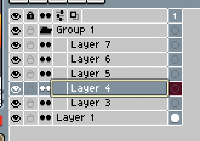
Another possible idea:

Screen Shot 2020-08-21 at 23.11.04

4 Likes

I second this. And it’s consistent with other art software I use (for painting, vectors, 3D, etc). It just makes sense.

@dacap
Alternatively, I would be ok with a very faint (almost invisible) unlock icon, if only for the sake of not leaving the square blank.

EDIT: I just saw this post Request: Alternate Lock Icon for toggle 'on' state - #14 by dacap

Which is basically perfect to me. I think this a good middle ground.

1 Like

Here a demo of the sheet.png: Dropbox - sheet.png - Simplify your life

The only difference (which is by code) is that the header will show the full padlock always so the user know that that column is about locking/unlocking.

image

4 Likes

Oh! Actually I like this one a lot. And it’s consistent with how the Cel icons are empty with a grey’d outline.

I would be very happy with this. For now, I’m gonna add something like this to my custom theme mod.

I think this is a good middle ground between “no unlock icon” and “solid black unlock icon” that currently exists.

3 Likes

When you say “by code” do you mean that this change would have to be done to Aseprite’s code itself, and can’t be done through the theme’s XML/PNG?

Also, this is a very good alternative. I like the grey outline icon. Though I would still recommend making the unlock icon’s hoop swung open to the side (like you would do with a real padlock). It just makes sense, and also makes the icons more visually distinct.

Alternatively, the unlock icon could be Key instead.
key

I think that looks pretty ok actually.

What’s important to me is not just that the brightness of the icons is high contrast, but also that the shapes are distinct. It’s more of a usability/disability thing, since my eyesight isn’t great. Similar looking shapes look like the same blurry blob to me, unless I get really up close and strain my eyes.

I also increased the lock icon’s loop/bar by one pixel, as I feel like the default icon looks a little bit like a purse or briefcase.

2 Likes

very nice i like the locks alot better then the standard locks… but im using a dark t heme at the moment is there a way i just can change the “open lock icon” inside my theme? would be awesome if u could point me in the right direction thx

The icons for themes are stored in aseprite files for each theme in a “user theme” folder. So you can simply modify the locks for your current dark theme using Aseprite itself, then reload the theme. I forget the exact location of where themes are stored, but you can check out my link here to download my custom lock theme, which has instructions on where themes go:

It has instructions on how to install themes as well as how to modify them. There’s also a dark version in the download and a few other variants. You can either use my theme as-is, or simply copy/paste just the lock icons into your theme.

Make backup copies of your theme before modifying them, in case anything gets messed up. It should be pretty straightforward though.

2 Likes