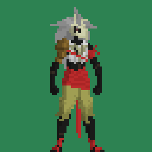
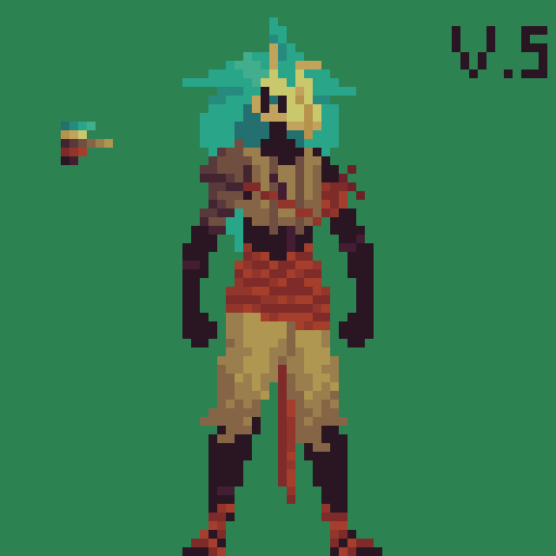
Hello! I have recently posted here a first draft of a main character for my game, and asked for some feedback. I still have to learn a bit about shapes and contrast on pixel art, but for the lask week I studied a bit about color pallet creation and character coloring, and wanted to show a comparison.
First is the initial draft, and second is an uptaded version with, what I hope is, better contrast and better color work in general.
Thank you for your attention! 
4 Likes
I would say this is an improvement for sure! There are some colors that I think are still too similar(the one on the arms is barely visible for example) and if you squint the shoulder piece blends in with the arm too much(at least IMO), adding more shadows on the pauldron/spaulders, or maybe just a consistent light source direction may improve it that much more. In its current state, it looks so lively that I want to see it animated, you did such a great job! 

1 Like
I was trying to keep the palette of the character to only 3 hues, which would be blue, yellow and red, so as I didn’t want the shoulderpad to catch too much of the eye, I ended up making it the same unsaturated hue as the chestplate and the pants. I didn’t really add a lot of shadow as I’ve been thinking of making an ingame shader for that, so I only added what was necessary to sell the shape of everything.
I’ll try changing up some colors to see if I get a more distinguishable “squint” view of the character, and see if I can make at least a preview shadow in order to get a glimpse of what it’ll look like ingame. Thanks a lot for your help!
very good indeed i welcome you to the world of color theory my friend.
1 Like