I’m back again, been busy with other things, I just had a slight realization, for making textures, is it okay to really go far off when it comes to things like the saturation? Because I don’t think I can imitate the original pic much with hue & value shifting

Can’t get the latter’s white properly, for instance, I think that’s part of what I was missing
TBH, I think I’m doing Hue & Value Shifting wrong as well, since some guys in Mr Mislav’s class don’t strictly follow the Higher Hue, Lower Value & Lower Hue, Higher Value-rule

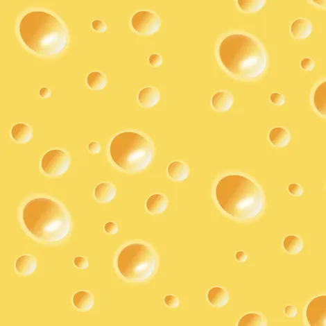
Just looking at the swiss cheese I can tell the holes are surrounded by lighter colors. I can also see that the holes have highlights to them. Another thing is that the yellow is indeed super saturated, but the most important thing is the fact that the darker areas are towards red which makes orange, not really desaturated dark yellow.
Thanks, any general advice when it comes to making textures and the saturation? All I mainly know is Hue+Value Shifting & TBH I think the Art Textures I am trying to base off of are different saturations & sometimes vastly different in-terms of Hue & Value
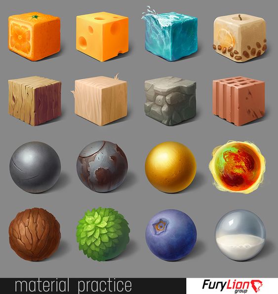
I would suggest making palettes from the materials( or at least experimenting) so you can get a good feel for how you want it to look. Working off shapes like circles and cubes like in the image is also a good idea because then you are not looking at a perfectly flat-looking texture. Last thing is to remember that lighting is not just in easing there are very imperfect lighting sources.
Kinda working on it already, though I don’t think I can get them onto squares