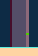
I’m using the Grid on a very low-res game sprite mockup and I noticed that if I zoom out enough, lines of 1px can appear differently, as if the left one was 1px wide and the right one was 2px wide (technically more like 1.5px but we know it must be an integer so mentally we assume it’s 2px).

Yet, you can see with my 1px brush in green that the right line is really 1px wide.
Because the blue grid eats some of the left line, the left line appears thinner. There is the same issue with lines touching the grid at the top vs the bottom.
The more the line color blends into the grid and doesn’t stand out, the more the issue is visible.
Could we have the grid placed more symmetrically (as much as possible while keeping it on integer pixels) to avoid the optical illusion?