The Beginning Of My Pixel Art Journey

Hi everyone! First post on the forums.

I’ve been learning pixel art for around 3 years now, issue is I’m the type of person to barely finish any artwork, even less often publish it. Decided to push myself to stop doing that and start showing my work & progress.

Started by making myself a new pfp, feedback would be very much appreciated!

Hope to hang around here more often with more stuff to hopefully show soon.

7 Likes

damn you have mad skill, hope you can keep the motivation up. theres nothing to critique here.

Thank you for sharing your artwork. Your drawing is great, and it took me a moment to find any room for improvement without changing the image significantly.

The one thing I saw is that objects under the skull are under-rendered in comparison, especially the hands and (possible toaster?). The lighting could be adjusted to match the head and give more depth.

The toaster would look better if you thought about it as a metallic surface with shine in more areas as well as bounce light, or if it isn’t a toaster then give it a more appropriate surface material shading. Another element is the edges of the toaster, it is very simple although it could use more defined edges.
As far as the hands you could add shadows in between the fingers and emphasize the general areas of shading again so that there is an underside to them (one that would match the shading of the toaster). Lastly, I think you could add extra fingertips to emphasize that multiple fingers are pressing up against the object whereas currently it looks flat and the thumbs seem to disappear.

While these things I mentioned could make those elements more fleshed out, as they are currently it still looks like you did a great job. I like your art and think you chose some nice colors, hope to see more from you!

(Sorry for my English, it is translated).

I like the drawing very much.

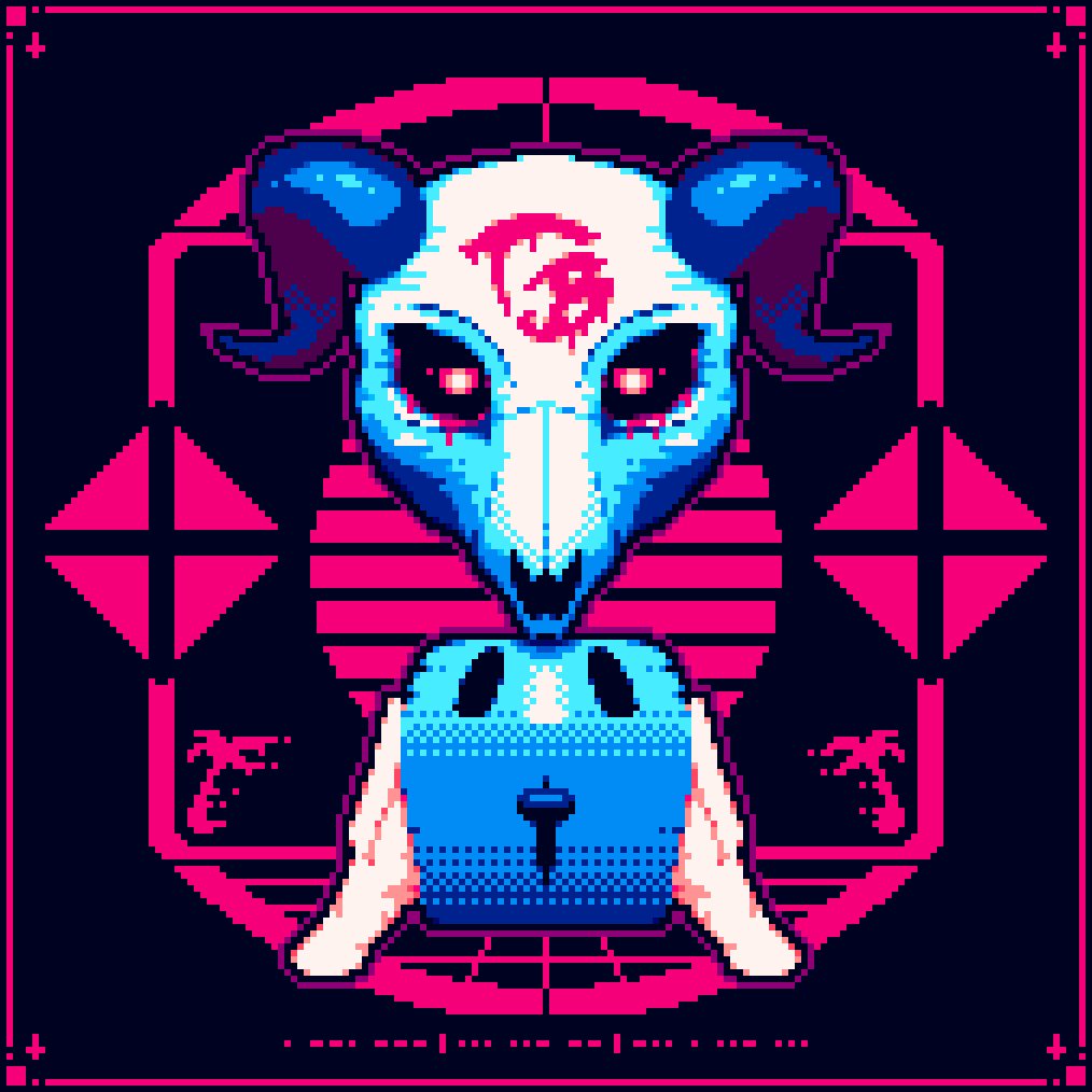
In my short understanding the only thing I would do would be to add a ‘fillet’ to the toaster to give it more contrast with respect to the hands.

It’s true that the hands have little contrast, but if it’s done that way on purpose, it’s fine.
If your intention is to make the hands a secondary object in the scene, I see it right.

The first thing my eye noticed was the skull, then the background and then the toaster. The hands almost went unnoticed.

If that was your intention, I think it is correct. If not, I would see where to put more contrast or how to draw more attention to one object or another.

I also see that you have used 11 colors. None with minority use so it follows that you have chosen the palette well and have made good use of it.

Keep it up partner!

Me gusta mucho el dibujo.

En mi corto entender lo único que haría sería meterle un ‘filete’ a la tostadora para darle mas contraste con respecto a las manos.

Las manos es verdad que tienen poco contraste, pero si está hecho así a propósito, está bien.

Si tu intención es hacer de las manos un objeto secundario en la escena lo veo correcto.

Mi vista lo primero en que se ha fijado ha sido en la calavera, luego en el fondo y después en la tostadora. Las manos casi que han pasado desapercibidas.

Si esa era tu intención, está bien. Si no, pues vería en dónde meter más contraste o como llamar más la atención sobre un objeto o sobre otro.

También me sale que has usado 11 colores. Ninguno con uso minoritario por lo que se deduce que has elegido bien la paleta y has echo buen uso de ella.

¡Sigue así compañero!