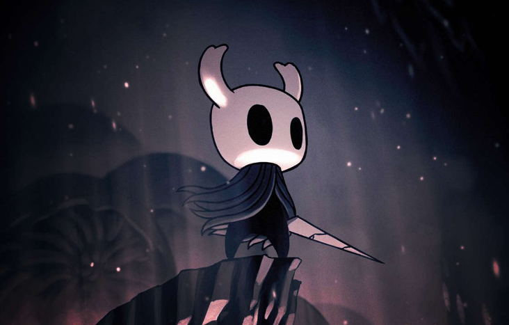
I tried making the Knight from hollow knight and failed miserably. I still haven’t finished, I will make improvements later one and finish it. Reference I used:
5 Likes
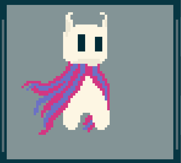
the shapes arent well defined, the cape is over detailed compared to the rest, however i think the biggest improvement you can make here is your colors, see in the image the light is tintet a magenta/purple and the shadows on him arent as harsh, try learning a bit more about pixelart shading and hue shifting, if you are able to apply those it will improve the artwork dramatically
here are some learning resources:
Pixel Joint Forum: The Pixel Art Tutorial
Pixel Joint Forum: COLORING “I dont get it”
i look foward to seeing your art improving ![]()
2 Likes
Thanks, I will make sure to follow the resources!
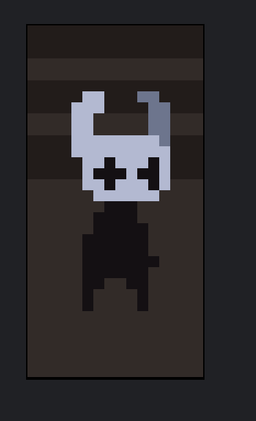
Hello, its been a while! I am back after a lot of stuff happened. Including moving to an entire different state (US), finally settled and having a space for my own, and not being motivated or passionate enough about doing art, I have been doing slowly but surely some progress on the hollow knight. I plan to finish it on the next 2 weeks or so!
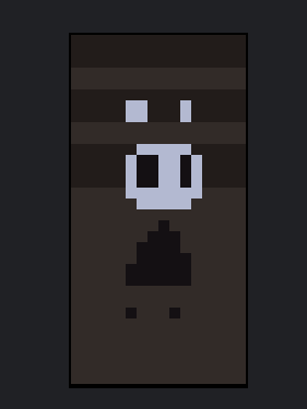
Here it is so far! I still need a lot improving on the lower part of the body, and the cape is still WIP but I like the overall shape it has. After I am done with the main structure and I am happy with it, I will continue with the colors. That’s all for now!
1 Like
I like your versions of Hollow Knight I notice the character has some details that make the character model(color, shapes, and specific sizing) distinct.
Measuring the horn’s lowest point sits right above the eyes, the body gets smaller towards the top and the feet get super small at the bottom; the cloak is perfectly sized to cover the body and yet float above the ground so keep that in mind when putting this character into a different perspective.
Props on finding a reference, I wouldn’t say you failed, just that your experience isn’t where you want it.
It might be easier to pick a side profile with the character’s head not tilted or their pose not super dynamic for a simple reference. The more you learn about the measurements or in other words aspects of a character: the easier making characters will be.
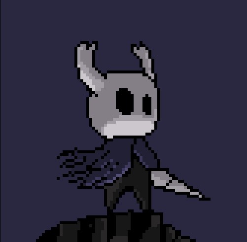
As far as just for fun(this has inspired me a bit) I’ve made a small sprite process and showed what I learned:
Step 1: Blockout
I did that for each part, I wanted the tips of the horns to be in the right place proportions could be changed.
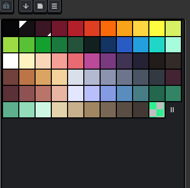
I always use a palate for this step as any color you could pick if you aren’t careful could be too close to another one in value or in other terms ‘brightness’; I like this one which is one of the presets:
Step 2: Add minor details
I realized that since the vessel is full of darkness he tends to look like other vessels. . . a bit scrawny with his arms only appearing when needed but very thick to thin and usually matching the shape of the body when retracted. The head shape of the vessel is a rounded trapezoid (tapering smaller towards the bottom) in some images so who would think that from looking at it from this angle?
I also moved the head shape a bit to allow for more space for the eyes, measurements in a larger drawing would be key but since this is smaller I’ll have to fiddle around and see what compromises I’ll have to make.
Speaking of compromises I noticed the farther horn couldn’t have an outline due to size limitations so I put it in pure shadow for now
it’s fine if things are a bit wonky at this step and the most important skill is using step 3 always.
Step 3: Back and forth edit and refine,
Just know that it’s very easy to make mistakes when making art, though much of art is also finding things you didn’t intend beautiful.
To make things as you intend you have to use tricks and think smartly about your time, so maybe try flipping the canvas, looking at the small view in the preview docker, and desaturating your image. Even if you know what you aren’t happy with it sometimes helps to use these techniques to get a different view of your art.
If your image doesn’t look like the character when small, you might need to change something. . .
![]()
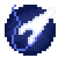
I went and played with the shading function in these options when on a brush tool. If you select a palate section it will draw the next shade up. This is handy when drawing lights and shadows and it will limit your draw area to the colors on the palate. You could use a simple ball shape to test it but I highly recommend trying this tool out! (might have to reverse shade if the colors are in the opposite order)
It takes about 2-3 minutes of filing to get something that looks rendered like this out of this tool:
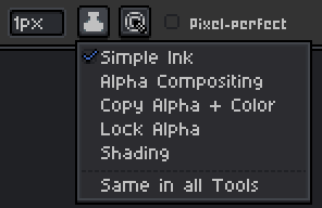
I used this method to create a ground (make sure to turn it off if you notice you aren’t drawing on other colors)
Thanks for sharing! hope you learn something from this ![]()
3 Likes
This is so useful, thanks for the reply. This version is way better executed then how I imagined. I will try re-doing it to see how it comes up , and I indeed learned something, Thanks again! ![]()
good luck, looks good so far!
1 Like
Uploading: Screenshot_1.jpg…
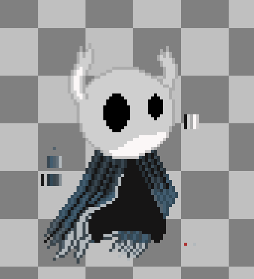
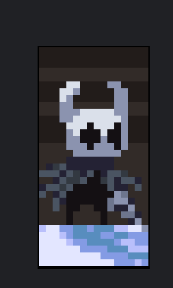
I decided to do it again…I wanted to do a background but I was too lazy.
4 Likes
I got hollow knight a few month ago i think and beat it for the first time lol
also that looks really good the left eye (from his perspective) is throwing me off a little but thats just me lol
Its been so long since i’ve been here!!!
the normal
![]()