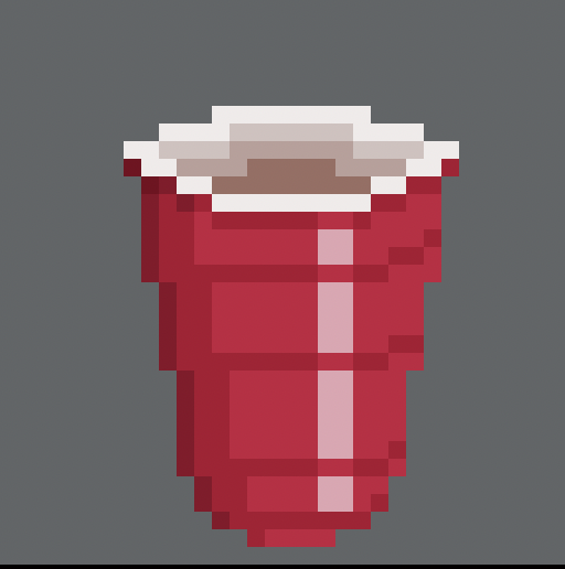
I am not so good with reflections and round objects, know what I am doing wrong here?
Not sure how I should account for the cup’s own individual lines
I know I should simplify things, but not so good with that yet
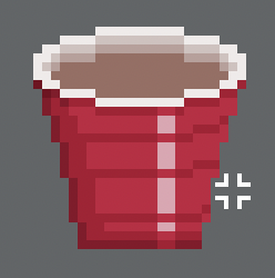
I am not so good with reflections and round objects, know what I am doing wrong here?
Not sure how I should account for the cup’s own individual lines
I know I should simplify things, but not so good with that yet
Once again good job on trying something you are not good at!
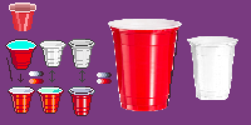
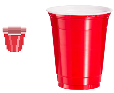
If you’re looking to create a circular object, one of the most effective approaches I have found is utilizing the circle-making technique I discovered in this video: Constructing Lines and Curves in Pixel Art (Tutorial) - YouTube
It’s not necessarily a rule, but it’s helpful to be mindful of your actions when copying or using references if you want to learn effectively. It’s great that you noticed the first and secondary highlights (reflected light for the darker light color) on the red cup. However, to improve the contrast between the darkest parts of the cup, you should be more careful with both the colors you choose and where you use them if you want to achieve the same level of vibrancy.
I made some adjustments to my design by using colored outlines to enhance its appearance. Specifically, I lightened the lines around the highlights on the cup(feel free to play with placement.) To improve the overall look, I utilized the “ctrl + U” shortcut to desaturate certain elements. Another technique I employed was creating a layer set to saturation and filling it with black, which allowed me to see the contrast of colors and brightness.
Thanks again, hopefully will have the energy and motivation to go through with this
Both of those cups look rather appealing! I would say that you may want to consider that there is one large section in the center if you want to go for accuracy, however, it looks pretty good.