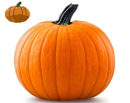
I am kinda confused on the lighting or how this one works in relation to the reference image, any advice?

I am kinda confused on the lighting or how this one works in relation to the reference image, any advice?

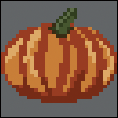
Using palettes made from your pumpkin and the reference and desaturating them both (small grey pumpkins on the top right) we can see that the distribution of brightness is a bit off.
When you observe the pumpkin, you’ll notice a few things. Firstly, there are groups of three bumps (although this is not necessary). Additionally, the bumps extend behind the stem, allowing us to see a portion of it. Lastly, the area closest to us is the darkest (excluding the stem).
To create the pumpkin shape, I utilized the mid-tone and shadow colors, as well as the darkest stem color, to block out the shapes. After shrinking it down and refining the outside shape, I used the “Shift + O” shortcut to generate an outline. Alternatively, you can access Outline under Edit > FX. Finally, I brightened the outline in the top left and top right areas of the pumpkin just as in the reference.
Thanks, will try out later
It looks better in some ways than your previous attempt. I do notice however that the bottom of the stem is so dark and doesn’t blend well with the top surface of the pumpkin. I can see you are starting to think about the shapes of the reference which is good, keep going!

Thanks, blending tool helps a lot

yeah thanks for the advice phantom