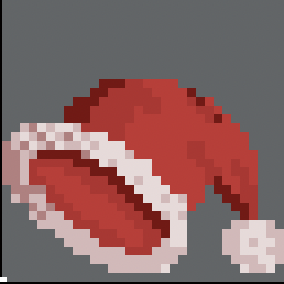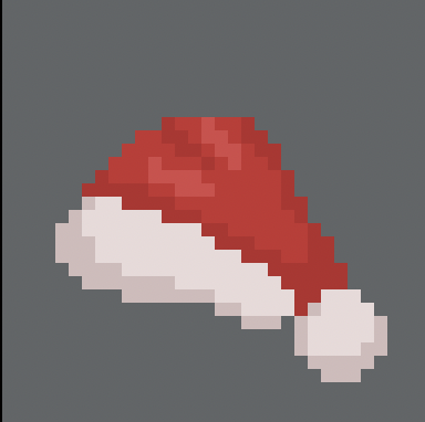
I am not so good with color harmony, so the whites of the hat are pinkish due to me using the blur tool for a shade of white
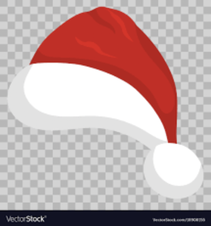
Unlike the source material
Also, since it’s not exactly a rectangular or square shaped object, I was confused on shading

I am not so good with color harmony, so the whites of the hat are pinkish due to me using the blur tool for a shade of white

Unlike the source material
Also, since it’s not exactly a rectangular or square shaped object, I was confused on shading
I think this was a problem with your reference as it is very flat and has almost no lighting giving the pixel art version almost no areas that tell you its shape is a Santa hat.
I guess I’ll change the reference
Question, would reducing the color palette of an actual pic help make for good material to base off of?
Potentially, provided you discover what colors are most important to the reference of course. If I squint semi-hard I can only see white and red, no darkness or shadows. Another reason I find it useful to use the preview window is to see how it looks zoomed out. That is in View > Preview
I’ll see about it
