So im aiming to make a small game for personal play and i want to design my own sprites for it. I am no pro at sprite art but im not terrible either. A issue ive run into alot is i feel limited for by existing color palattes for the scope of my project. I want the theme of the game to revolve around nature gardening plants and id love to have many different colors for woods and the plants themselves. Now this being said in a guide i watched on skillshare i was told that as a general basic rule each color for brighter or darker should be hue shifted by 5-10 and brightness raised or lowered by around 20. But comparing this to other peoples pallates i dont see this rule being followed as much and am lost trying to figure out how to design my dream palatte for this project. Any tips or advice would be amazing.
The #help section is for help with Aseprite. Your question is a general art question, not specific to Aseprite.
There aren’t really rules with hue-shifting beyond that you usually want to do at least some hue shifting. For example, I often make my shadows more saturated as well as bluer, but for the darkest ones, I lower the saturation and hue shift less, there are no linear relationships. The specific values of the tweaks vary from ramp to ramp, and palette to palette.
I like to build my palettes while working on a mockup for the project. That way, I can see how the palette
actually works. It’s always an interative process too, I usually tweak existing colours when I add new ones, so that all the ramps look good, and so that there’s attractive contrast between different ramps.
Let your gut guide you. And then maybe add some more contrast ;D
Hi Eve_Wake,
If you can stomach another tutorial, I’d recommend Pixel Parmesan’s take on the subject. Here is an excerpt:
Many pixel art tutorials reference something called “hue-shifting,” which generally refers to how the hue of an object should shift towards the opposite direction (“warmness” or “coolness”) as the value of the object is also adjusted. While it is true that the hue should change, this is actually not a distinct concept or technique—because the way an object appears is dictated by the qualities of a light source (or multiple light sources) as applied to the object in addition to the local color of the object, all of the properties of color (yes, including the hue) are always shifting. Approaching rendering from this “hue-shifting” perspective oversimplifies the paradigm of 2D art as a whole while also failing to provide any explanation for why this would be the case. Because there is no color without light, palette construction should not be something wholly devoid of context or thought regarding rendering light and shade.
If you still want to pursue hue shifting as a rule of thumb after that, try experimenting with color representations other than HSV/HSL. Specifically, ones that attempt to match human perception, for example Lch, Okhsl or HSLuv.
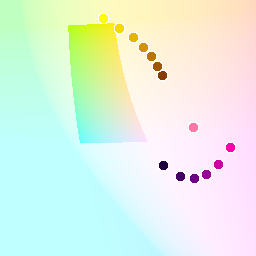
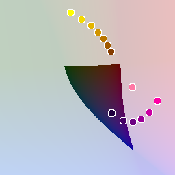
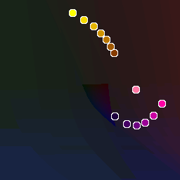
Here is a discrete color wheel generated with Okhsl. I’ve selected #2a8f00 as a key color. In Okhsl, that’s 140 hue, 100 saturation, 50 light.
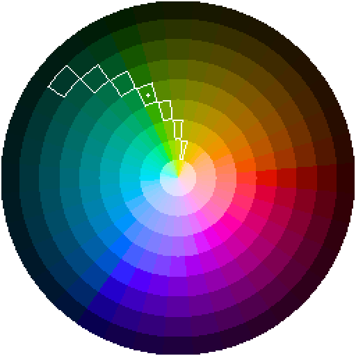
This is the ramp formed by the selections above.
![]()
GIMP Palette
Name: Okhsl Shades
Columns: 0
  0  56  42 00382A
  0  84  53 005435
  0 114  50 007232
 42 143   0 2A8F00
108 165   0 6CA500
158 186   0 9EBA00
207 208   0 CFD000
If you weren’t familiar, this text can be copied into a text editor, saved with the .gpl file extension, then loaded into Aseprite by clicking on the hamburger menu above where it shows your palette swatches.
Here is the palette I get with traditional HSL. The key color is the same visually, but different numerically: 102 hue, 100 saturation, 28 lightness.
![]()
GIMP Palette
Name: sRgb HSL shades
Columns: 0
  0   5   1 000501
  0  41   1 002901
 12  92   0 0C5C00
 42 143   0 2A8F00
 90 194   0 5AC200
155 245   0 9BF500
212 255  41 D4FF29
The first color doesn’t actually follow the rule because it bumps up against the minimum possible lightness. In my opinion, this ramp isn’t as good as the Okhsl one.
Per eishiya’s suggestion, here is an experiment in contrast with the okhsl ramp:
![]()
GIMP Palette
Name: Contrast Stretched
Columns: 0
  0  12  10 000C0A
  0  56  42 00382A
  0  99  54 006336
 42 143   0 2A8F00
133 175   0 85AF00
207 208   0 CFD000
255 241 189 FFF1BD
The hue and light offsets increment by 15 rather than 10. This is maybe too extreme an example, though. The first color has a lightness of 5; the last color, 95.
Hue shifting associates shadow with a dark violet and brightness with a pale yellow, so I find it difficult to understand or to offer advice on what to do if you want your key color to be yellow or violet. In some cases the rule of thumb seems to suggest adding/subtracting increments. In other cases it seems to suggest easing from violet at low light to yellow at high light in the rotational direction – clockwise or counterclockwise – along which the key color’s hue rests.
I think it’s helpful here to see where these hues land on a 2D cross section of perceptual color space that isn’t stretched to meet our expectations that color has to fit onto a circle.
Here’s an animated version.
Yellows remain highly saturated even at high light. Blues are the opposite, they can remain highly saturated in low light. These spikey slivers don’t give you much room to shift around, though maybe desaturating can help.
I’d also recommend studying screen shots in addition to palettes. Like eishiya said, palettes are develop within a context. Look at screen shots in color and in grayscale, preferably in a tool that allows you to stretch the contrast. This is to help you from mistakenly believing that a certain effect is the result of color choice alone when it could arise from a combination of choices.
For example, here’s a screen cap from Eastward, sourced from Polygon.
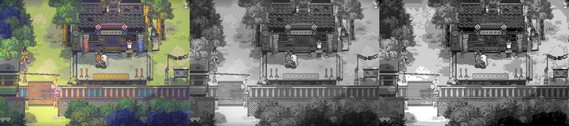
From left to right: original color, smooth grayscale, gray with 7 gradations.
If you want an example of how this screen shot’s use of contrast can be analyzed, see this tutorial video by Adam C. Younis. You might set yourself an exercise to take your palette and recolor this image (or a screen shot from another game similar to your own design).
Lastly, I should point out that I’m not an artist. I’m offering advice only as a coder who’s interested in the topic. So take with a grain of salt.
Best,
Jeremy
Thank you so much for this reply i forgot to thank you for writing this as im a bit of a scatter brain