[Extension] Palette Helper

Hey there! As some of you were aware because I kept posting in the help section, I’ve made an extension to generate gradients/palettes.

If you’ve ever used the gradient or gradient by hue features in aseprite, chances are, you didn’t quite get what you wished for. Inbetweens of colors being desaturated or another color showed up inbetween.

My goal was to create a tool to give you bit more control over your gradients and opening up custom palette making to more people without having to learn a good deal about color theory and how to pick colors (You should at least be familiar with these things if you want to use this tool to its highest potential)

The project was inspired by domjohn’s Color Shading extension, which I’ve modified to automate making better colors, but quickly realized, I wouldn’t be able to mod into what I wanted it to do.

I wanted to give the user as much control as possible to create custom gradients, using different interpolation methods.

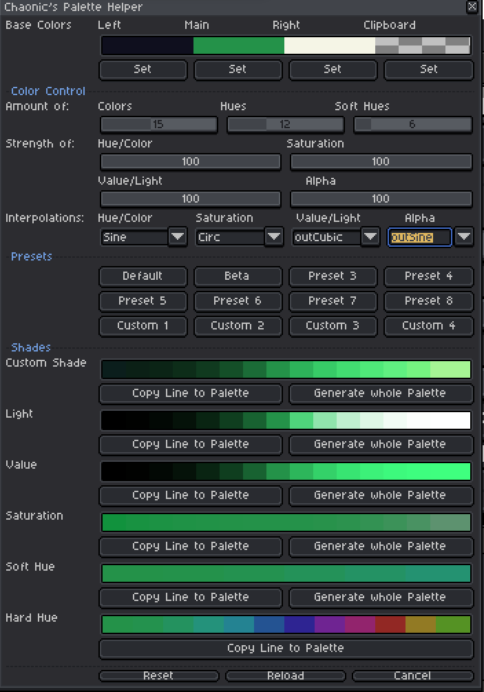
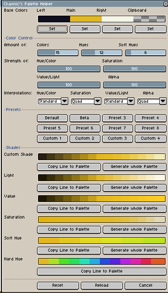
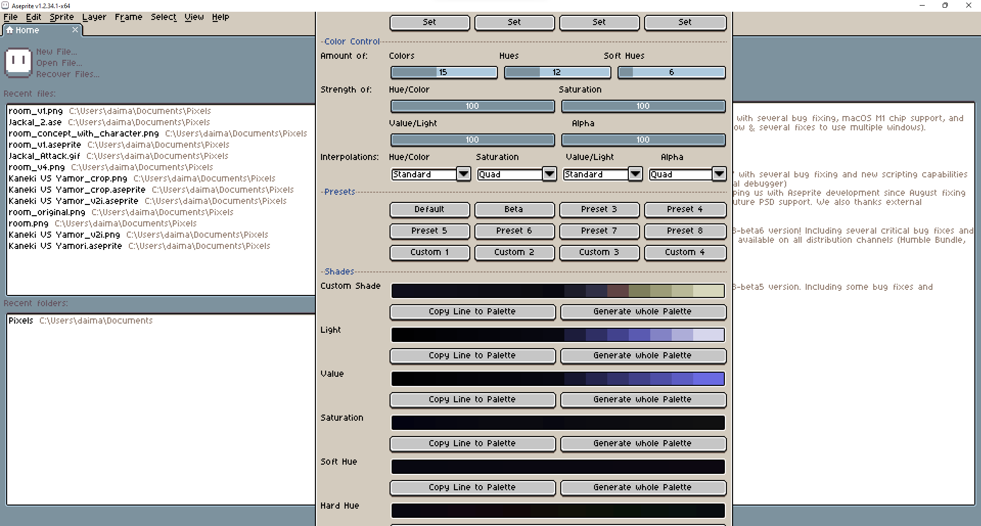
But let me demonstrate. With just a couple of clicks, you are able to generate a palette like this:

The number of colors in each line and the amount of hues is completely up to you. I’ve set the minimum and maximum amount of colors to 3 and 32 respectively, but it can easily be edited, should you ever require more (or less) for some reason.

The biggest highlight and pretty much entire reason for the tool is the custom shade, which interpolates the three base colors in RGB and replaces their saturation, value and alpha based on independently set interpolations. This way, you’ll get a more consistent color palette.

If you really really like what I’ve made, consider donating a couple of bucks on itch.io. However, if finances are rough or you are a student, just consider it a gift. Times are rough as they are, and it already doesn’t feel right to ask for money. Let alone from people who might be worse off than me.
Don’t think, this is worth money? That’s also fine! I’m already glad if people have some use for my tool! :blush:

Questions I’m anticipating:

Q: The base colors show a dark blue, red and light yellow color, but the blue and yellow aren’t actually in the gradient.
A: Imagine the “Left” and “Right” color on each side of the gradient. This is where they’d end up. Because you wouldn’t have multiples of the same color in your palette, the tool won’t try to copy them in. If you want to have a copy of the colors, you’ll have to manually add them.

Q: When generating the palette, some/a lot of colors are missing.
A: In cases like this, this means the color it’s trying to add is already present in the palette. Basically, when interpolating multiple different colors into the same shade of blue, there will be overlap, as colors get “closer together”. Getting rid of this “problem” is a whole issue in itself that I don’t know how to tackle, so your palette will unfortunately look incomplete and imperfect. But chances are, you won’t even need that many colors and should try to reduce the palette to the bare minimum anyways! =)

Download

itch. io

github

Special thanks to Olga Galvanova, thkwznk and behreandtjeremy for your help with figuring things out, locating problems and giving instructions on how to make scripts!

I also want to thank domjohn for making the Color Shading extension, which helped me gain some footing in LUA and inspired me to make my own extension!

Also thanks to dacap for giving us this amazing program. Aseprite is hands on the best pixel art program!!!

And if you are reading this, thanks to you and really all of the community. You are amazing! There’s not that many communities I’ve felt this welcome after asking a bunch of stupid questions! :smiley:

Have a nice day!

11 Likes

This is pretty cool!

Any chance of a checkbox to include the left and right colours in the output? That would make this tool more convenient for generating ramps with colours chosen on the fly, rather than from an existing palette.

3 Likes

This will take me a little bit, but sure!
I didn’t think leaving it out actually mattered, just give me a day or so! :slight_smile:

2 Likes

Looks pretty nice, but right now the window extends beyond the top and bottom of aseprite window hiding most of the controls, including resizing the window by hovering over the top or bottom border (which are outside the screen).

So I cannot use this tool at all which is a shame. Any chance you might fix the UI so that it doesnt overextend ?

1 Like

I was playing with the script to get a feel for it and ran into this issue when changing the alpha interpolation to outSine. I don’t know if this is a bug or a user error. Just wanted to let you know.

Edit: I checked the code and it was a small typo. Make sure to update line 477 to say:

Previously, it said:

As far as I can see there is no need for a Reset button. Just get rid of the Reset button and run this at the end:

do
    CL = colorLeft
    CM = app.fgColor
    CR = colorRight
    CC = colorClipboard
    AOC = amountOfColorsVar
    AOH = amountOfHuesVar
    HS = hueStrength
    SS = satStrength
    VS = valStrenght
    AS = alpaStrength
    HI = hueInterpolationVar
    SI = satInterpolationVar
    VI = valInterpolationVar
    AI = alphaInterpolationVar
    reloadColors(dlg.bounds)
    dlg:close()
end

Similarly, from a usage standpoint, I can’t see any effect from the reload button. The cancel button doesn’t even appear to work (However, I think a cancel button is a good idea). What is generateCalcTable() supposed to accomplish when the user clicks the cancel button?

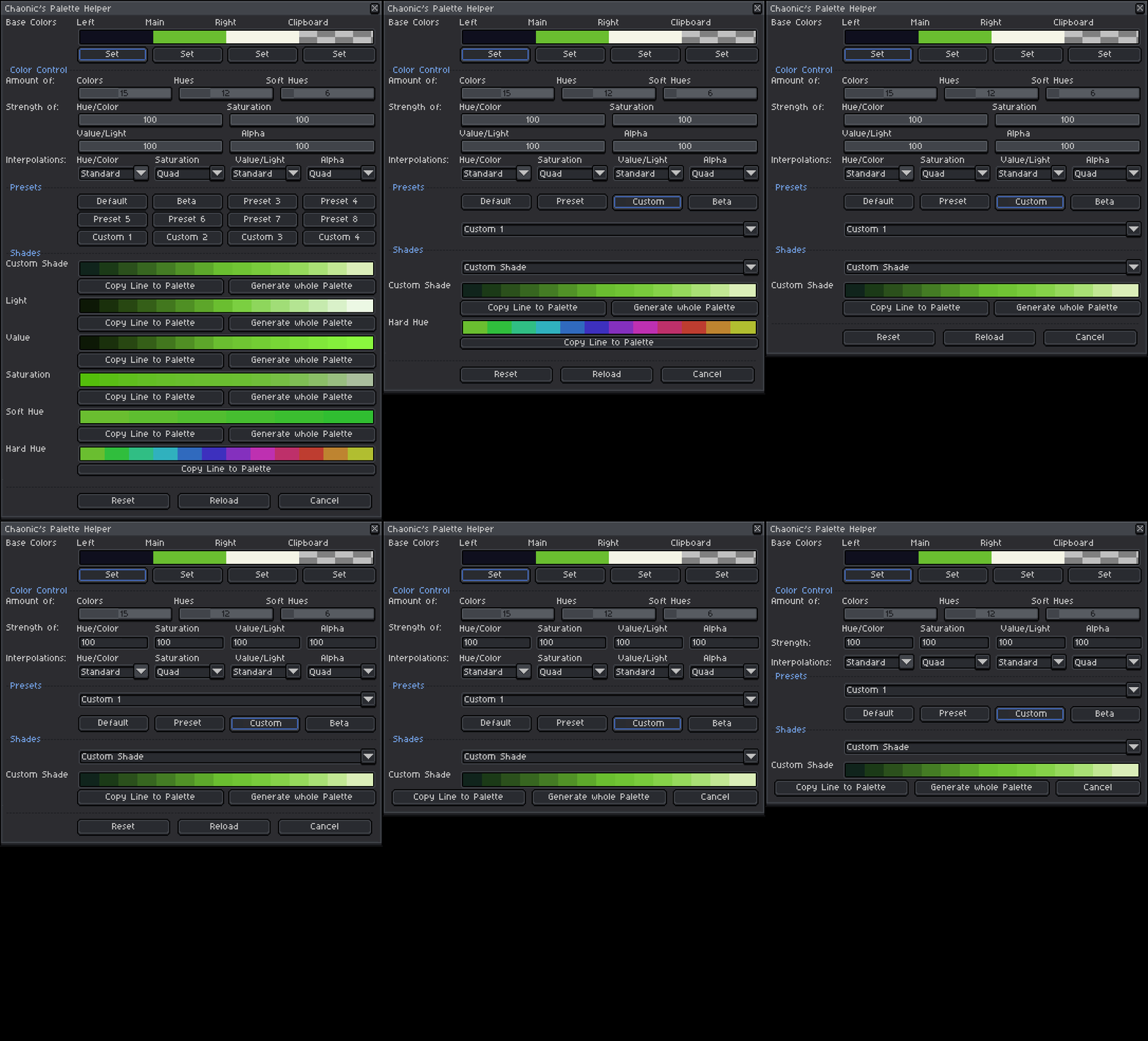
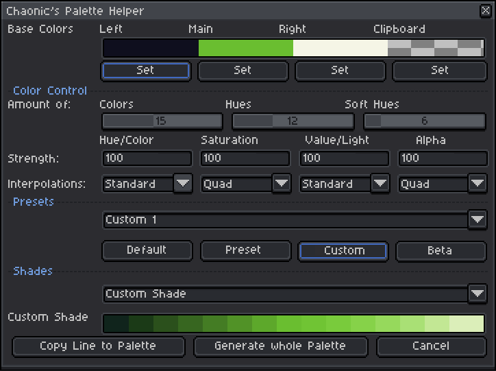
I did a few mock-up designs of Chaonic’s Palette Helper in Aseprite. I made sure that all the changes are consistent with what the API and his code will allow. I was able to shrink the minimum window height from 984 pixels to 541 pixels. That is a 45% reduction in height.

Chaonic's Palette Helper UI Redesign Workflow J19

The main changes are:

  • removed reset and reload buttons.
  • moved the cancel button up a line to be with copy line to palette and generate whole palette
    -removed the many shader windows (The dialogue window deletes itself and makes a new version each iteration so it would be best to simply use a combo box and update which shade set displays based on the value from the combo box)
  • added shades combo box
  • removed the many preset buttons; updated to 4 preset buttons: default, preset, custom, and beta
  • added preset combo box. This is a similar idea to the shades combo box, however you change out the options in the preset combo box depending on the preset button that is selected
  • changed the color control sliders into numerical input boxes
  • moved the “Strength” and “Interpolations” text down to the same level of the numerical input fields and combo boxes respectively. This is achieved by setting the label for “hueStrengthSlider” to label = “Strength:” and setting the label for “hueInterpolation” to label = "Interpolations: ".

The final version looks like this:

Now I’m going to tweak the code a bit to see if I can get the UI looking like this.

3 Likes

These are some good changes! The window looks a lot tidier.

I think a “Show All” option in the Shades dropdown would be nice for people who want to quickly access multiple palettes at the cost of a larger window height.

Would the numeric inputs for Strength still pop up sliders if you click and drag on them, the same way some of the native ones do? Sliders are convenient for iterating.

Those are great suggestions! I was just about to implement the UI changes now. I spent a few hours trying to make undo work (on the cancel button). I finally got it working but it is a little slow since I can’t seem to make it work with app.transactions. It undoes only one chunk (no multiple undo operations if you generate several times in a row), but it’s still better than manually undoing with ctrl+z or in the palette widget.

Would it be better to just remove the number input and keep the sliders then? Based on your suggestion, I tried writing a test script that would appear as a number at first but change to a slider if you right-clicked… I couldn’t get that working either :sweat_smile:

I’d keep the sliders. However, you’ve given them very little space in your version, so they might not be able to select every single value between 0 and 100, which is also a problem. Messy as it is, the original gives them enough space to give at least one pixel to each possible value xP

Okay. Will do. I believe the main concern was just that the original was taller than a screen anyway. As long as it isn’t that big, I doubt anyone will complain.

Hey there! Thanks a lot for the suggestions and the bug report.
I could have sworn, I had the whole outAIne thing patched out before it saw the light of day, I even ran a replacement command over the entire thing.
I’ve also just changed the cancel button logic. Completely went past my radar, for some reason, I was using the cancel button to reload things for a long time. That’s embarrassing. :smiley:

Now to address your recommended visual changes.

My biggest driving factor in the visual design of this extension was to give instant visual feedback to any and all changes made. So if you change any of the strength sliders, change a value somewhere, you’d see what exactly your change does. I do see a point in hiding a lot of the buttons and shades, if the user knows what they are doing.
For that reason alone did I include this many presets, so the interpolation drop down menus wouldn’t overlap with any of the shades. (If you can’t see the change, it’s hard to make adjustments)
That being said, I have an idea to replace the interpolation functions with bezier curves and replacing the drop down menus completely with sliders.
That being said, I’ve only included drop down menus, because I haven’t come up with a better way to change the interpolation method at the time.

The reset buttons function is a bit of a failsave. If something happens to be messed up, you can go back to how the tool looks on startup without opening it again. It also wipes the clipboard.
For that matter, you could say the reload button is also a failsave, in case something got updated that I haven’t accounted for. I’ve had glitches that required both of these in the past. That being said, maybe they aren’t necessary now as they used to be, but I prefer to keep them.

Even if I add a combobox to control which shades to show and which not to, given my visual design philosophy, at worst, it makes the maximum height of the window even taller. I do agree with the notion to reduce the height, but at this moment, I’d be more likely to remove either the values or the lightness shade lines to achieve this.

When I get the time to do a bigger rewrite, I’ll remove at least one line of presets, if it’s not possible to save them as .json files somehow.
That being said, I’m slightly confused about the presets section in your mock up and how that’d work. Since every preset besides the custom ones have values assigned. Would you put two thirds of them in the combobox, while leaving the rest out?
Maybe I’ll create a second window to put the presets in. I don’t know yet. I’ll have to give this more thought. Ideally, everything would be in one(ish) place.

I see why you’d want to have an input box for the strength, but this again goes against my design philisophy. If you’re working with your tablet, it’s easier. Yes, I can save half the space, but it’s going to be hard(er) to control with touch and tablet. For that matter, I also wouldn’t really be able to put them all on the same line, because it would be harder to set to a specific number.

I know my response probably looks like a lot of different flavors of “no”, but I’m taking your suggestions to heart. Originally, the tool was supposed to be much smaller/straightforward, but I kept on adding ways to give the user more control, and this list will probably not shrink. Maybe if I was able to put all the shades into their own window, that’d make things tidier. I’ll go over this problem hopefully soon.

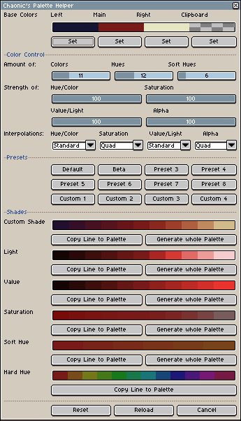
Oh and also, how did you get the minimum window height of 984 pixels? At 100% aseprite scale, the window should only be 602 pixels high. That’s more than 50% taller than it’s supposed to be. Here’s the window in native resolution:


Even if you have only a 720p monitor, it should be able to show the entire widget.

Either way, I fixed the outSine bug and gave the Cancel button its intended purpose. I’ll have to do something for a friend and then I’ll get to adding the left and right base colors to the shades output. =)
I’m sorry the widget is such a mess. ^__^’

I said that the minimum height at which the whole thing properly displayed was 984 pixels. Previously, a lot of buttons were cutting off on my screen and I was only able to use the tool because I have a second monitor mounted above the first. When I turned it off and used my main screen only, then the tool was hardly usable.

Edit: it was also just an estimate since I was using a screenshot and throwing that on a layer in aseprite. I edited the mock up on the same layer as the original so that even if my estimate of the original’s absolute height was incorrect, the relative difference between the original and the mock-up would be within an acceptable error tolerance.

Oh, you mean the screen needs to be at least 984 pixels high to properly display the extension??
Yeah, that’s a big problem…
I think I’ll make a mini version that cuts out everything that’s not absolutely necessary, like the dividers and presets… The comboboxes will definitely be in the way, but…
What if I just made the whole thing wider in general?
I’ll have to do something for a couple of hours before I can get back to this. But I’ll fix this!!!

1 Like

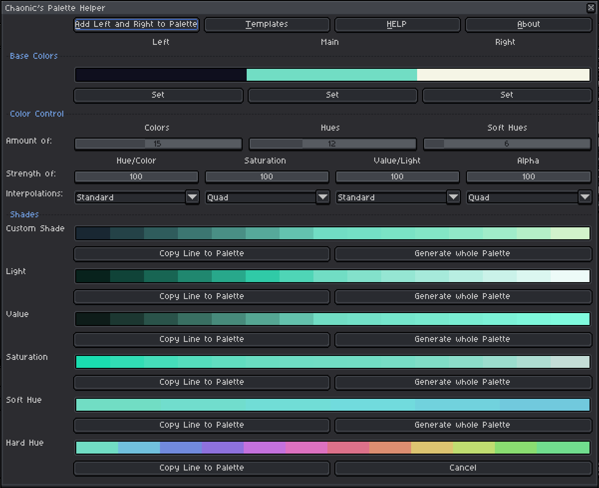
After discussing with Chaonic, I stopped trying to shrink the UI as small as I possibly could. In some ways, it’s more convenient to have a large window for palette prototyping (though maybe Chaonic coud add an enlarge/shrink check box in the future). This is what the newest version looks like:

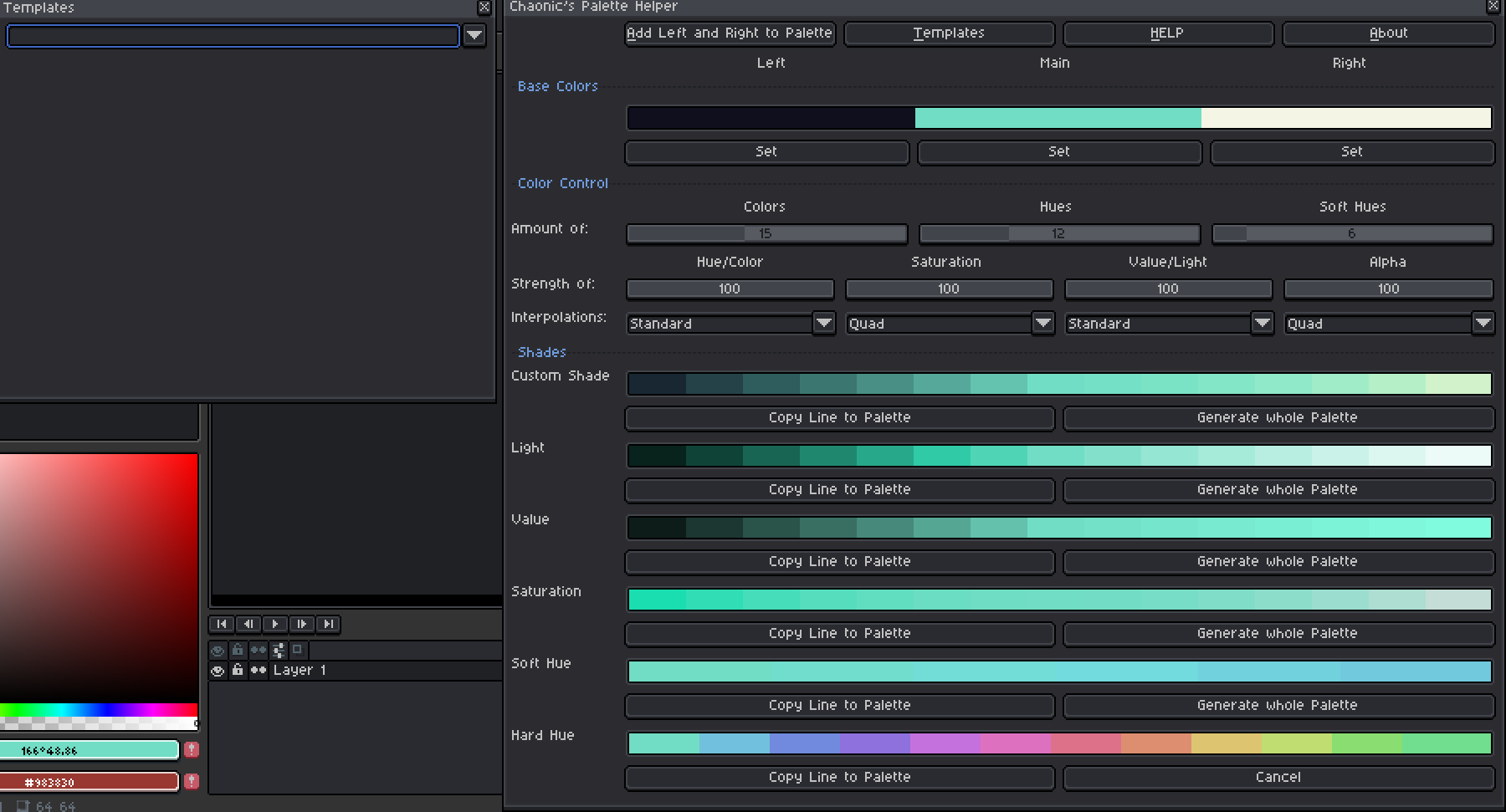
The template loader window pops up next to the main one

I’ve written all the modifications to the Palette Helper in lua without any errors. The code is pretty much done except for creating the template loa[quote=“J19, post:15, topic:14429, full:true”]
After discussing with Chaonic, I stopped trying to shrink the UI as small as I possibly could. In some ways, it’s more convenient to have a large window for palette prototyping (though maybe Chaonic coud add an enlarge/shrink check box in the future). This is what the newest version looks like:

The template loader window pops up next to the main one

I’ve written all the modifications to the Palette Helper in lua without any errors. The code is pretty much done except for creating the template loader and functionality for the “Add Left and Right to Palette” button.

1 Like

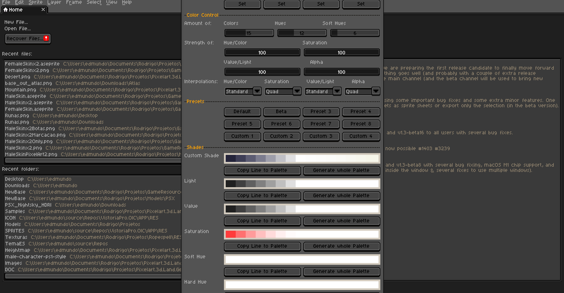
This is what I get when I start the script :

My monitor resolution is 1080p with scaling at 100%, so I don’t think there is some weird OS scaling that could cause the issue. Is there something I’m missing ?

that’s definitely 200%.
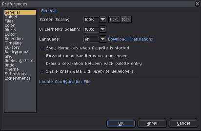
there are two types of scaling: screen scaling, which will scale everything on screen including artwork and ui elements scaling, which scales only gui.
so if you have both at 100%, it’s much smaller. like this:
ui-scaling
ps. you can, of course, have a scaling set up in your os too.

Oh I see ! Thanks for that !

I literally just discovered those options as I was playing with themes lol.

The 100% does make the script window fit, but the general UI becomes a bit small for my taste ! Compromise I suppose.

I think it would be nice if the UI could expands on two column if the window gets stretched enough.

2 Likes

EDIT: You can get the newest version here: New and Improved Palette Helper - from J19 and Chaonic

Hi friend!

So, try to use the script, but i found a problem:

I don’t have enough screen height resolution, so it’s possible create a scroll bar for the script?

1 Like