Hi all,
I have a feature request out for this, but thought I would give it a go myself with a script. Here is a script that allows you some better control when applying a palette to your image. Currently it’s designed to load in an image, then run the script to “palettize” it. I haven’t really thought about supporting multiple frames or layers yet.
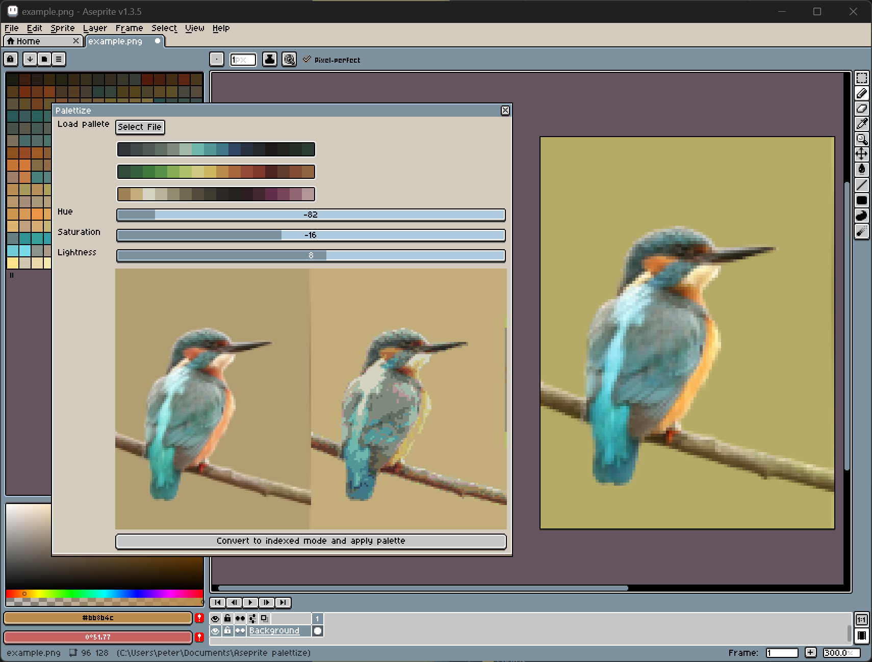
It allows you to load a palette and then preview your image with that palette applied. You can adjust HSV sliders until you are happy with the mapping before applying it.
I plan to add more adjustment options - specifically I’d like to be able to adjust color channels separately. There are many cases when blues map to greens, for example, so I’d like to tweak just the green channel to get a better mapping.
Script is available here: https://github.com/projectitis/aseprite-script-palettize
It’s V1, so be nice 
8 Likes
Now added the ability to adjust color channels individually for better control. For example, if the image is matching too many reds, select the red channel and bring down the saturation, and those colors will start to match browns or other colors.
1 Like
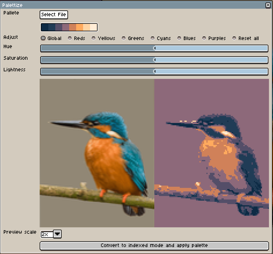
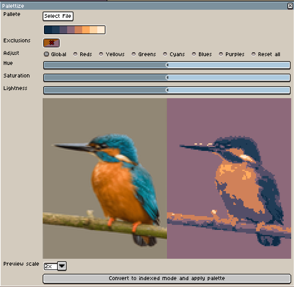
I have now added the last feature I wanted: Exclusions.
If you see a weird color being matched when you are palettizing, simply click the weird color and an exclusion rule will be added.
This prevents the underlying color from matching that palette color. It has a 10% tolerance (currently not adjustable) so that similar colors will not match that palette color either.
Click the exclusion rule to remove it again.
Example
Here I am matching this Kingfisher to a palette. I don’t like how the orange of the belly is matching the same purple hue as the background. I want to create a new exclusion rule to exclude that specific match.
I click the belly of the kingfisher on one of the purples pixel that I don’t want to match to the orange below. It adds an exclusion rule, and will then match that underlying color to the next closest palette match instead.
The exclusion swatch is two colors with a cross between them. It means “If you see this top color, do not match it to the bottom color”.
You can click any exclusion to remove it again.
p.s. While I was at it I also added the ability to select the scale of your preview images 
3 Likes
This is a godsend! Thank you<3 Just one request/suggestion, would it be possible to add a scroll bar on the window (or a way to minimize the palette colors)? When working with large palettes, the palette colors take up the whole window making it impossible to see the preview or press the apply button (pictured below).
1 Like
Thank you for the kind words. I’ll have a go over the weekend. I’ll also make better use of the space by stretching the palette over the full width of the dialog. This will make it shorter, too.
1 Like
@ketsuppi400 I’ve updated the script in the github repo (see above for the link).
- Palette is now 32 swatches wide (instead of 16) making better use of space
- Ability to hide and show the palette
Enjoy!
1 Like
Perfect! Thank you so much! <3